Atlas in a Day Challenge: A Global, Real-time Collaboration

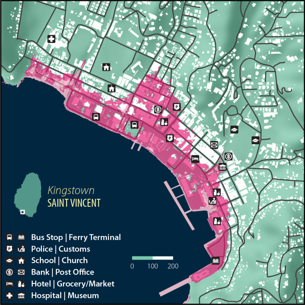
On Saturday, October 5, 2019, more than 50 guerrilla cartographers gathered, in person and online, to collaborate in producing an atlas in a single day on the theme of migration. While researching and designing an entire atlas on a complex theme in the span of 24 hours is indeed a challenge, this volume of maps is a concrete demonstration of the power of global, real-time collaboration.

Pre-challenge publicity poster

Pre-challenge publicity poster

The mission of Guerrilla Cartography is to promote the cartographic arts widely, and to expand the art, methods, and thematic scope of cartography through community workshops and symposia, public exhibitions, and collaborative projects. We imagined the Atlas in a Day challenge as another such collaborative project, one that could bring a diverse group of ideas and people into the mapping process. After all, we had already figured out how to engage a global community in producing a substantial and beautiful atlas in a few months, so why not see what we could do in one day? We knew there would not be time for comprehensive editing, nor money to finance a fine printing, but our main objective was to build a community around a collaborative mapping project, one that could then say something through cartography about an important theme.

The theme of the Atlas in a Day project — migration, broadly defined — was announced to the Guerrilla Cartography collaborative only the night before the challenge, via a livestream at 9 pm Pacific Time, from Federation Brewing in Oakland, California. The following day, some 35 participants met at Oakstop in downtown Oakland, and began sharing ideas and working on maps. Together, we enjoyed invited speakers, food, and collaboration all day long.

Darin Jensen, announcing the theme live on Facebook.

Darin Jensen, announcing the theme live on Facebook.

A DAY OF MAPPING

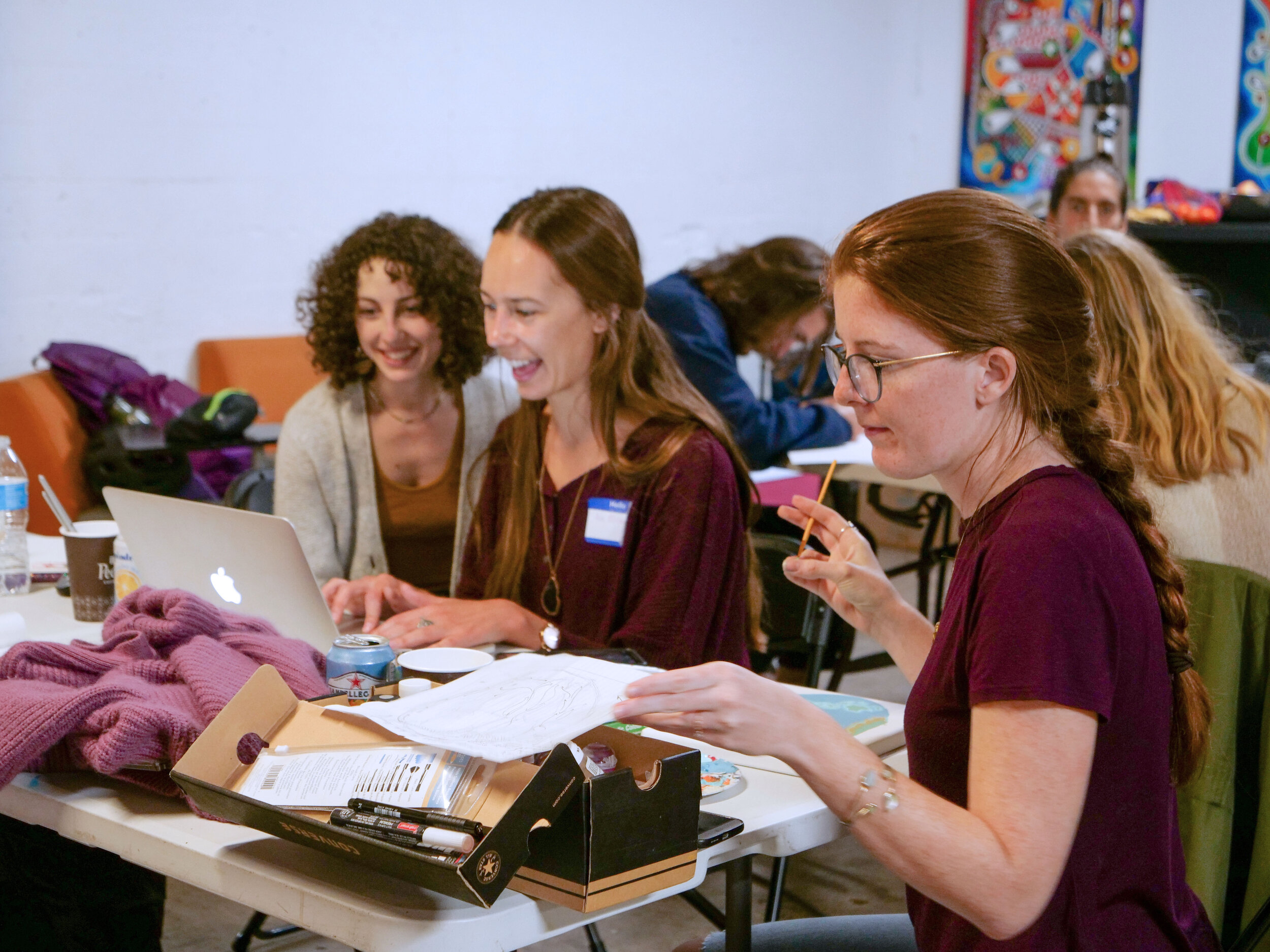
With morning coffee and donuts, we started the day with “Geospatial data from the US Census,” as UC Berkeley economics Ph.D. candidate Zach Bleemer offered a practical demonstration of accessing public census data. After Zach’s demonstration, the guerrillas settled in to working on their maps, mining data, and pulling out art supplies.

Zach Bleemer

Zach Bleemer

At midmorning, our Atlas in a Day keynote speaker, Professor Diana Negrín, an instructor at UC Berkeley and the University of San Francisco, spoke on the ethics of mapping in her talk, “Represent, Visibilize, Dignify.” As she described in her abstract,

“The practice of mapping is fundamentally anchored to the act of representing places, peoples, species and the less tangible elements that inhabit the spaces where human and non-human life circulate. These acts of representation transmit worldviews that can ultimately lead to material consequences, be they just or unjust. Just as a map can provide perspective and insight into the otherwise unseen, it can also become a tool that tracks, disciplines and distorts the represented ecosystems and peoples. In this talk, we will contemplate what forms of visual enunciation have the capacity to paint a more just portrait, considering specifically the ability to portray whole narratives and dignity in the practice of writing and visualizing an increasingly bordered world.”

Diana Negrín and guerrillas

Diana Negrín and guerrillas

The guerrillas continued collaborating and sharing ideas throughout the morning and early afternoon.

GC board vice president Maia Wachtel, Åse Mitchell, Whitney Newcomb

GC board vice president Maia Wachtel, Åse Mitchell, Whitney Newcomb

Guerrilla friend and Atlas in a Day co-organizer and contributor, J. H. Blakeslee, set up a sandwich bar where everyone found something delicious to eat. After lunch, with full bellies and a lot of good information and positive energy, the guerrillas settled back into their individual and team mapping projects.

J. H. Blakeslee and Molly Roy

J. H. Blakeslee and Molly Roy

At midafternoon, Guerrilla Cartography co-founder, former board member, and freelance cartographer, Molly Roy spoke on map design. Titled “Not just a pretty map: How to be an effective visual storyteller,” her talk focused on how to effectively communicate concepts and data on a map, from color theory to data representation to narrative blocking.

Molly Roy

Molly Roy

With all the talks concluded by early afternoon, and a 7:30 pm submission deadline looming, work on mapping continued.

Max Shen and GC board secretary Sydney Johnson

Max Shen and GC board secretary Sydney Johnson

Creating on computers, paper, and boards; using crayons, watercolors, embroidery thread, and other media, the challenge collaborators submitted 43 maps on the theme of migration by the 7:30 pm deadline. A single electronic file was compiled and one rough print on a scrappy printer was attempted by 9 pm, fulfilling the challenge.

THE MAPPERS

Whitney Newcomb’s full-time day job is making maps at a computer. Atlas in a Day gave her an opportunity to explore other, non-digital mapmaking options. She said, “I had a canvas and some acrylics in my closet that were just screaming, ‘Make me into a map!’” She waited patiently for the theme announcement at 9 pm on Friday night, and then turned to searching the internet to find her eventual subject: the longest migration in the world, that of the Arctic Tern. She spent the rest of the night and into the morning researching and drafting a map on paper, then transposing it to the canvas before heading to Oakland to meet up with a friend and go to the event.

Whitney Newcomb

Whitney Newcomb

“I spent the day trying to get as little paint on the table and myself as possible while listening to the presenters and the other cartographers around me making incredible maps in all kinds of ways! We all shared paint and stories as this talented and passionate group of people came together to create something more than a map, more than a book—a community of cartography!”

Chasing Starlight: The Earth’s Longest Migration

Chasing Starlight: The Earth’s Longest Migration

While Whitney created her map on her own (but in the company of that “community of cartography”), others worked in teams. Alex Epstein, Joshua Douglas Hubbard, Allison Whitaker, and GC board vice president Maia Wachtel joined their individual expertise to research, draft, and embroider a map.

Joshua Douglas Hubbard, Maia Wachtel, and Alex Epstein

Joshua Douglas Hubbard, Maia Wachtel, and Alex Epstein

Alex Epstein had never done any kind of cartography before, but as a graduate student researcher he frequently thinks about how to condense complex information into one meaningful figure. The Atlas in a Day challenge provided him “a new framework to approach that concept, and that was very exciting to me.” Epstein studies new materials for recyclable plastics, and believes part of the solution to solving the problem of plastics is reducing our dependence on non-renewable resources like petroleum. He proposed to his team that they trace the “migration” of a petroleum molecule as it is processed into a plastic bottle. Epstein’s team chose to embroider their map on card stock. After researching and sketching their design, they spent the bulk of their time embroidering the map.

Ethylene Migration: From Crude Oil to Your Plastic Bottle

Ethylene Migration: From Crude Oil to Your Plastic Bottle

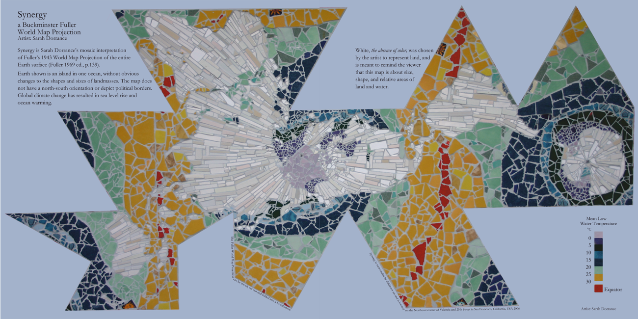
Also working in a team, Sarah Dorrance and David Kardatzke brought their collective talents to the Oakland event to get started on their map and to hear the speakers, and then went back to San Francisco to finish and submit it. Dorrance, a mosaic artist, previously contributed to Guerrilla Cartography’s Water: An Atlas and contributed to the GC blog with reflections on her map and experience. She also mounted the first public exhibition of the nascent Guerrilla Cartography group in 2012 when she included Mission Possible: A Neighborhood Atlas, in her art map show, “Maps Only: Radical Cartography in Contemporary Art,” at Back to the Picture in San Francisco.

For their map, When a Road is a Wall, Dorrance and Kardatzke focused on the California migration of the California Newt (Taricha torosa), a creature whose migration they’ve witnessed multiple times near Livermore, California. Dorrance said, “GC offered us a place to highlight their migration plight and connect it by title to the wall being built on the US southern border to keep migrants out; and possibly ‘to keep US citizens in.’”

When a Road is a Wall

When a Road is a Wall

Another 28 people joined the challenge remotely, many watching all the presentations via a live feed, from 14 other locations in the United States and five locations in Canada, Panama, and New Zealand.

From his studio in Missoula, Montana, Steven R Holloway contributed The Gate at the Crossing at El Coyote on the Vamori Wash to Many Dogs Place, an evocative ink-on-crumpled-kōzo map marking a space of crossing between the United States and Mexico — a crossing Holloway has hiked. Reflecting on his journey there, he wrote,

“. . . one day the green border people stop us. Ask to see ID. Demand to search our packs. Stopped. My heart is beating hard. Beneath my feet there is a stream of water. Moving across the border; the Vamori Wash. Cottonwoods. Open the gate. Close the gate. Does it really matter? . . .”

The Gate at the Crossing at El Coyote on the Vamori Wash to Many Dogs Place

The Gate at the Crossing at El Coyote on the Vamori Wash to Many Dogs Place

Hollloway, an artist mapmaker, used a string coated with brown-black ink to snap a line along the US/Mexico border. He blocked out the border gate, and then added it in via letterpress in orange-red. His source materials were many, including a USGS quad map showing where the Vamori Wash crosses the border in the Tohono O’odham Nation, southwest of Tucson, Arizona. The Tohono O’odham Nation is bifurcated by the border, and now reserved to a small part of their original land north of the border. “On all the maps I research there is always this line. This abstract line ... longitude this, latitude that. Sometimes on the maps there is nothing at all on the other side of the line.” The ethereal nature of Holloway’s geographic representations has inspired Guerrilla Cartography to open its last two atlases with his work.

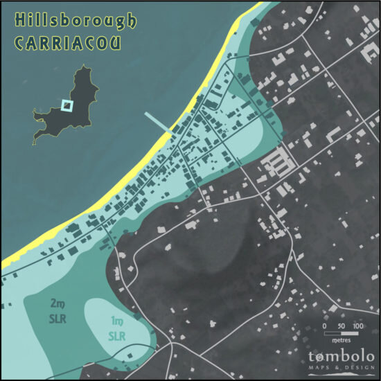
Joseph Poirier and Brendan Rahman spent the Saturday of the Atlas in a Day challenge in Seattle working together — collaborating as a guerrilla cell — to create the map Migration Away From Flooded Land in Seattle, which shows where people and jobs could be displaced by sea level rise over the next 130 years. Colleagues at a transportation planning firm, they spent a large part of their day, “batt(ing) around a number of ideas but struggled to come up with something that we were interested in mapping, was meaningful, could be completed in one day, and was somewhat challenging.” With a subject finally chosen and ample, familiar basemap data, they searched out the sea level rise data and, “interrogat(ed) the structure of the data and figure(ed) out how to best represent it.”

Migration Away From Flooded Land in Seattle

Migration Away From Flooded Land in Seattle

Poirier and Rahman split up the mapping tasks “to play to our strengths.” Poirier created the basemap and did the analytical work while Rahman created the design, happy, as Poirier said, “to do some recreational cartography . . . It ended up being a great way to spend a Saturday.” They were pleased with their final output and appreciated the opportunity to make a one-off map, as opposed to one that needed to adhere to design guidelines so that it could be incorporated into a suite of maps: “[The Atlas in a Day Challenge] allowed us to be more creative with the aesthetics than we often can be for work projects. We’re looking forward to next year’s Atlas in a Day!” Guerrilla Cartography didn’t make them wait that long; the Atlas in a Day: Community challenge was held on May 15-16, and many of the maps made that day reflected the impact of the global COVID-19 pandemic.

From Panama City, Panama, Mir Rodriguez Lombardo joined the challenge and, working from some previous research, chose to map Plant Migrations. He read peer-reviewed articles to decide which plants to map and employed QGIS and Inkscape to create his art, with “frantic iterations near the end.” Unfortunately, a communication breakdown with GC staff (namely, me) resulted in only two of the four plant migration maps Lombardo made being published in the printed version. We regret this error and are pleased to publish his intended two-page spread here. A correction to the digital version is in the works and Lombardo’s complete maps will appear there.

Plant Migrations

Plant Migrations

Of the event, Lombardo said it was “great to listen in on the talks and to feel part of a bigger thing.” Guerrilla Cartography is pleased to have created a community of cartography and found that collaborations across the globe in real-time are not just possible, but fruitful.

Margot Dale Carpenter, a freelance cartographer in Belfast, Maine, joined the challenge because, “I really like the idea of an artistic splurge effort and it seemed like a great way to push my abilities (and) limits. Instead of over-thinking a project, this demanded a run and dive-in. I liked that.”

American Eel: The American Eel’s Journey to Freshwater

American Eel: The American Eel’s Journey to Freshwater

Her map, American Eel: The American Eel’s Journey to Freshwater is based on a well-established migratory pattern that passes by her town; she has seen the American Eel in the Atlantic Ocean off the dock in downtown Belfast. While she loves hand-drawing maps, she decided on a digital medium because it’s easier to deliver a higher quality image (no scanning required) and the challenge time limit made it more efficient to work digitally.

THE ATLAS

After the challenge day, GC took a little time to reflect on the maps that were created and then ordered them into a sort of narrative, both graphic and philosophical, by choosing just one of the myriad possible arrangements. A final document was published online within a week of the challenge; click here to download.

The maps in this atlas interpret the theme of migration in diverse ways, considering the movements of people, animals, climates, physical materials, and cultural artifacts over time and space. Some of them represent the culmination of years of research on a critical topic; others are quick sketches inspired by current events and concerns. Collectively, they add substance and content to one of the most critical issues our planet faces today.

The atlas cover

The atlas cover

This post is based on an article by the author that was first published in Cartographic Perspectives 94.

Migration Away From Flooded Land in Seattle

Migration away from flooded land.jpg

How did you decide on your map subject for the Migration atlas? 

Deciding what to map was the hardest part of the Atlas in a Day experience. The first night, we developed a number of interesting concepts but nothing felt quite right. Were data available? What interesting story would we tell? Did the content actually matter?

With time and adult beverages[1] dwindling rapidly, we decided to keep our migration map local to narrow our options. Both of us are transportation planners and regularly make maps in Seattle, so we’re familiar with the local data, unique cartographic challenges, and transportation issues (after all, migration is transportation).

By midnight, we had considered mapping salmon migration, peak hour bus ‘migration’ to and from downtown, and tech worker migration to gentrifying neighborhoods. These were interesting and challenging concepts, but – in the grand scheme of things – still felt less than ideal for the Atlas in a Day challenge.

We finally settled on a map that merged ecology, climate change, transportation, and land use planning: the migratory impacts of sea level rise in Seattle’s Duwamish Valley. We knew data were available, were genuinely invested in the product and its message, and were both excited about visualizing the information in a vivid way.

The East Duwamish Waterway, looking north towards downtown Seattle

The East Duwamish Waterway, looking north towards downtown Seattle

We chose to map sea level rise and the migration of people and jobs from the Duwamish Valley because it is one of the most vulnerable communities on the Puget Sound. A significant portion of the developed land in the Duwamish Valley is former intertidal zone that is now home to commercial and industrial family-wage jobs, as well as lower-income residential communities. Because much of the area is landfill, critical infrastructure in the SoDo (South of Downtown), Georgetown, and South Park communities is very close to sea level, placing it within the zone likely to be inundated by sea level rise. For residents of these neighborhoods, the anticipated change in sea level compounds environmental injustice: the Duwamish Waterway is a superfund site located in an inversion zone where pollution settles from nearby air, road, water, and railways.

The West Duwamish Waterway, looking south

The West Duwamish Waterway, looking south

What was your mapmaking process? 

We split the work between the two of us. Joe focused on gathering data, developing an ArcGIS layout of the information, and conducting statistical analysis in R on the number of jobs and people that would be displaced with each additional foot of sea level rise. Brendan took the data out of GIS and developed the color palette, symbology, legend, and other cartographic elements of the final product in Illustrator. Brendan also designed and produced the data visualizations included with the legend. We worked together to define a map extent and determine what key geographic elements should be included in the final product.

We designed our workflow so we could work simultaneously, without wasting time waiting for one another to complete tasks or finalize assumptions – after all, we only had one day! As an example of this workflow, Brendan set up a basemap, decided on colors and fonts, and designed labels while Joe analyzed various sea level rise scenarios. It ended up being a remarkably efficient process and one we’ve continued using professionally.

What surprised you during the map-making process?

For us, one of the most surprising findings was how vulnerable jobs were, relative to dwellings. In hindsight, this makes perfect sense, given how many large worksites are located in the Duwamish Valley. We had initially assumed, however, that the residential communities of South Park and Georgetown were more populous than our data sources showed them to be. We should note, as well, that the Duwamish Valley is home to a large number of people experiencing homelessness, who may not have been accurately counted in the American Community Survey population estimates.

We were also surprised (and very excited) to learn how much we could accomplish in 24 hours. Our skills complemented each other in a way that made the process easy to streamline.

How do you hope this map might affect people?

At the end of the day, we hope this map raises awareness of the human and economic impacts of climate change. We think the special power of cartography – which can communicate massive amounts of information in small spaces – can help people understand and visualize these impacts.

It's also worth noting that we produced this map from free, publicly-accessible data. Anyone with GIS and design aptitude can recreate this map for places near and dear to them.

[1] This Atlas in a Day brainstorming session was unofficially sponsored by the Duwamish Valley’s Machine House Brewing.

Blocking Sediment Migration

Blocking Sediment Migration from Colorado River Basin to Gulf of California

Blocking Sediment Migration from Colorado River Basin to Gulf of California

I didn’t intend to map human migration for the Atlas in a Day project. My plans for a map of the migration of sediment in rivers raised some eyebrows at home, mostly wondering how the subject would fit in an atlas on migration. My wife suggested I ponder the relevance of mineral migration, especially in an age when so many migrants are in need of secure passage. Did the idea of mapping inanimate matter, albeit bearing minerals that were a source of animal and vegetable life, imply a lack of empathy to migrants’ fates, or display a shocking disconnect with the politics of an atlas with such a timely theme? Guerrilla Cartographer Darin Jensen, outlining the project, presented the theme as open to any subject — birds, animals, bees, migrants, ideas, inventions — but sand? “Daddy, make sure you understand the project before you submit your final draft,” my teenager cautiously reminded, apprehensive as she heard me wax poetic on the nourishing natures of coastal California rivers she knew and loved.

The Colorado River proved a perfect topic for sediment migration, I relearned that morning. Its expansive watershed moves sediment across state lines as well as national frontiers, delivering sediment to the Gulf of California, known as the Sea of Cortez prior to the twentieth century. Borders are inherited conventions, imposed on landscapes and encoded in maps. But since World War II, they have become a basis to redirect and apportion waters of the Colorado, motivated in part by the new national protectionism of guarding our frontiers.

Sediment flow in the Colorado River, view from Nankoweap in Marble Canyon, Grand Canyon National Park. Photo by Michael Quinn, NPS.

Sediment flow in the Colorado River, view from Nankoweap in Marble Canyon, Grand Canyon National Park. Photo by Michael Quinn, NPS.

Redirection of the Colorado’s flow began in the 1930s, at a time of national scarcity, and continued during the 1940s, in ways that had immediate and massive repercussions on sediment flow to the coastal ocean of the Gulf of California. The dramatic closure of the Colorado’s water flow paralleled the remapping of national water rights, and eventually of the continental shelf, which privileged a nation’s exclusive rights to its seabed resources. This broad territorialization of natural resources within state bounds popped out in striking terms as I looked at how the Hoover Dam impacted sediment flow. With President Harry Truman arguing that the nation must defend itself by protecting its seabed resources in the global chessboard of the postwar era, where territorial lines were quickly redefined, watershed flows were recast as national water rights.

The redirection of the waters of the Colorado was ambitious in scope, with several projects damming its flow to irrigate winter lettuce in the Imperial Valley, cantaloupes and melons in Arizona, and beans, green chile, and cotton in New Mexico. The damming projects also created patterns of seasonal human migration from Mexico, formalized in the bracero program. Redirection of water compromised the Colorado Delta, destroying farming communities south of the border and decreasing land values there, while inflating those north of it. The apportionment of water rights from the Colorado, defying the logic of riparian rights, became a new paradigm for dividing water flow in what might be considered the Age of Impoundment, lasting from roughly 1925 to 1970, which saw a worldwide frenzy of dam mega-projects.

At its apex, construction of the Hoover Dam on the Nevada-Arizona border, on the river's main stem in 1936, was the crowning achievement in staking national water rights. This was followed by Imperial Dam in 1938, Parker Dam in 1938, Davis Dam in 1951, and Glen Canyon Dam in 1966 on Lake Powell, as chapters in the massive project of creating farming lands and redirecting — or blocking and obstructing — historical sediment flow. 

The Colorado’s expansive Upper Basin, sprawling across the states of Colorado and Utah, drains 90% of the waters that once flowed so abundantly south at a rate of almost 400,000 cubic feet/second in the late nineteenth century. The Hoover dam redirected a monumental 3.25 million cubic yards of water, and in its immensity, became a symbol of the nation’s power and prosperity.

Hoover Dam, April 2019 (photo by the author)

Hoover Dam, April 2019 (photo by the author)

The massive dam plundered the waters of the Colorado, the “American Nile,” as a resource to irrigate farmlands in Arizona, California, and Nevada, which were promised in the concordat of 1928 to receive 37.3%, 58.7%, and 4%, respectively, of the redirected water. This bounty, however, ended the flow of suspended sediment flowing south or the border. The Hoover Dam, which imposed this uneven trade-off, is shown as a red dot in my map of Blocking Sediment Migration.

The line on the map represents the nourishment of the riverbed ecology that distinguished the habitat of the Colorado. When naturalist Aldo Leopold navigated the Colorado’s sand bars by canoe in 1922, he marveled at the wealth of natural life that “had lain forgotten since Hernando de Alarcón landed there in 1540.” It supported an abundance of life that populated the Colorado River delta in “lagoons so diverse in wildlife — egrets, cormorants, skittering mullets, mallards, wigeons and coyote, as well as jaguar.” To Leopold, the Colorado River was both “nowhere and everywhere,” containing hundreds of green lagoons that led to the pristine wilderness of the Delta, enriched with annual spring flooding that ended just fourteen years after he explored it, as the flow of sediment that offered food supplies for native humpback chub, razorback sucker, and seabirds was curtailed. 

The obstruction of all that sediment from the powerful flow of winter snowfall across the Colorado Upper Basin, which melted at a rate of 100,000 cu ft/sec, effectively ended the natural wealth of a region that oceanographer Jacques Cousteau christened “the world's aquarium,” and with it the economies, ecosystems, and agriculture of the delta lands. Prior to the dams, the river sediment supported many productive farms near its delta, once farmed by Cocopah Indians. The small community of farmers living on the Hardy River — the remaining trickle of the Colorado that only sometimes reaches the Gulf — has been reduced to only 200 – 300 today.

Map by David Lindroth, Inc., Copyright Yale Environment 360

Map by David Lindroth, Inc., Copyright Yale Environment 360

The problems of mapping sediment flow are profound: the issue lies in the nature of data collection, and the difficulties of smoothing data from river sampling stations, tabulated by different folks, to create a compelling graphic record of sediment flow. USGS sampling stations were seasonal, measured differently if with regularity, and offer quantitative challenges, making it difficult to compare the earlier flow to the amounts of sediment cumulatively trapped behind dams.

In light of this, I reconsidered the mapping of sediment impoundment as a human intervention, haunted by a near-obsession with the recent political mismapping of “illegal” immigration. The idea of mapping sediment as a problem of migration across national divides became a map of blocked migration. “The Hoover Dam is the exact precedent to the Border Wall,” I said to two Guerrilla Cartographers at my table in Oakstop, and they nodded in affirmation.

The human side of the Hoover Dam story is the rise of seasonal migration to work the fields the dam made possible. The diversion of the Colorado allowed irrigation projects from Nevada to the Imperial Valley, creating a massive market for the migration of cheap agricultural labor. A series of laws and unilaterally dictated diplomatic agreements, initiated August 4, 1942, structured the Mexican Farm Labor Agreement and set the pattern for northward human migration and hemispheric economic dependence that persists to this day. No map of hydro-engineering is complete without the story of migrant labor movement that it created, but that story has been regularly ignored in maps of water diversion. Mapping the blockage of southward sediment migration makes clear the structural parallel between dam arch and border wall.

In the map, I marked the extent of impoundment by a red line engraved into the landscape, a disruption of sediment flow, to remap what was more often celebrated as an engineering feat of controlling water flow around the border. Suspended sediment in the Colorado declined tenfold in its annual tonnage in the 1930s, with maximum loads of suspended sediment at Topock, AZ dropping from 7.64 - 20.6 million tons/day to half a million.

The USGS had effectively tabulated the range of sediment the Colorado carried south from Lake Mead. C.S. Howard compiled readily available USGS data of suspended sediment in the River through 1941, based on a survey of sampling stations below Lake Mead, reflecting conditions before the dams across the Upper Basin and Lower Basin of the Colorado. The gloriously retro USGS map that Howard used to locate the gauges afforded a base-map for my own map, which would contrast the line of the stopped flow of sediment with the dot where the first section of the Border Wall has been built.

The final version of the map, drawn on a transparency, was rough: it needed to show the rivers that lead to, and the watershed of, the Colorado River in bright blue, with a line of blocked sediment to the Gulf rendered in red, against its expansive watershed.

The coastal ocean is not depicted in my map — and if we had over a day to create a map, the delta would merit closer detail. Some restoration of the Delta was recently allowed by water treaty modifications adopted in September 2017, ensuring a continuous flow of river water to the Delta to regrow its habitat. But the picture of blocked migration is clear, and the red dot stands in a provocative symbolic dance with that red line, making us reflect on the power of maps and mapping borders and boundaries.

The diversion of water was a massive story that had been told, but at a time when the Colorado no longer reaches the sea, I wanted viewers of my map to consider the parallels between the paranoia of blocking human migration and the power fixation of diverting water away from natural migratory paths. But as even Lake Mead today faces the prospect of going dry, the impounded sediment has been dispersed to the north, its nutrients never able to reach the shore.

Damming the flow of the Colorado River demands to be understood as a project controlling the movement across borders, and dictating regional ecologies from behind borderlines. Seen through this lens, wasn’t the Hoover Dam, as much as any other structure, the model for the unilateral control over migration, whose ambitions are today recapitulated in the Border Wall?

The Migration of the Word Honey

honey-1024x780.jpg

This map was a first for me. It was my first collaborative map, it was my first map I worked on using LinkedIn’s chat as much as Photoshop, and it was my first exposure to Guerrilla Cartography. Karen reached out to me to work on the Atlas in a Day project, but immediately we had to work around an ironically geographical, problem. She would be working out of Oakland while I was in Colorado.

My normal mapmaking process involves a stray spark of an idea, and then a mad rush of research, design, and editing, all in my home office isolated from the outside world except for coffee. Lots of coffee. It’s an intensely personal process, conforming to my own schedule and entirely up to my own ideas. This can become a problem when there is a client making their own requests, and in the case of truly collaborative maps I had to pass off part of the design duties.

Karen’s eye for design is perfect, not only because it’s clever in ways I could never imagine, but also because it’s different. Every person approaches a challenge in a different way. Having the bravery to exchange ideas freely with someone else through every part of the design process will give results that neither person could have conceived of individually.

When the Atlas in a Day  challenge arrived, we quickly passed a few ideas back and forth and settled on the movement of language. Specifically, the word ‘honey.’ Honey is an ancient word, imbued with deep cultural meaning across thousands of cultures and even more thousands of years. We divided work duties following our relative strengths. I would design the base relief and then I would pass it off for labelling, detailing, and overall design.

Working remotely can be difficult because there is nobody to casually turn to from your chair, ask a question, and turn back to the screen. It takes an extra degree of discipline to be available to talk, to be technically able to communicate, and then to get the important questions settled. Its terrifyingly easy to not open the chat window, plow forward ahead, and remember late at night, oh yeah, maybe I should check in. Karen reached out through LinkedIn, so we used that to communicate. We were both on the computer all day except for travel. I was totally isolated from the other participants in the competition, relying on Karen to pass announcements or ideas back to me. After I produced my relief, I passed it off to Karen to finish.

Any of us can open Google Maps (or Bing Maps, not my preference) and get an accurate, instantly updated, global map of the planet that will automatically plot your way to any destination. It is tempting to think cartography is dead in a world when its apparent purpose is so perfectly realized, but cartography is as much an art as a navigational tool. I treat making a map no differently than writing music. There are only so many sounds, so many chords; but how they are arranged, how they are layered, how they are interpreted produces more combinations than we could ever run through in the total lifespan of the solar system. Like a song, a map tells a story, but instead of soaring over a melody it does that over a landscape. Our map showed how just a single word could travel across half the planet, scattering across language, meaning, and culture. The colors of our map, the vibrant colors and the hexagons, even the fonts, are all choices that Google Maps are not designed to make.

Karen

I first learned of Carl’s work in July, when he won the post-secondary student map competition at the 2019 Esri User Conference. After looking at his portfolio I was excited for any opportunity to work together, and the Atlas in a Day Challenge seemed appropriate – nothing like the pressure of a 24-hour deadline to forge a new working relationship! Happily, Carl agreed, and we began communicating through LinkedIn messaging as soon as the topic was announced, and then throughout the next day, as he worked in Colorado and I headed to the Guerrilla Cartography event in Oakland.

I am new to the Bay Area, and looked forward to meeting some like-minded map people. Everyone at the Oakstop space was super nice, and the encouragement, camaraderie, and idea- sharing flowed freely (along with so much good food!). After we chose our topic and cartographic responsibilities for the Honey Migration map, the rest of my morning was pretty unproductive. Carl’s base map was beautiful, but for my part (design-wise) I wanted something more than just lines. The word we chose lent itself perfectly to a hexagon (honeycomb) shape that thus far in my cartography projects I had avoided – and I even said something like “ok but let’s not overdo the hex symbology…”

honey-1.jpg


So, I covered the entire page with hexagons.


honey-2.jpg

It wasn’t until I got home at about 1pm that my work on this map really started. Honestly, Carl did the research, so we had a lot of back and forth regarding my understanding of the information and how/where to place labels.


honey-3.jpg
honey-4.jpg
honey-5.jpg

As I had told Carl, I was really into this golden yellow color lately, so color and the hex shape were the focus of my design. I used a lot of “darken transparency” in Photoshop for the text and the hexes because it deepened the color to a warm, rich brown while allowing the map to appear beneath. 

Collaborating with Carl from remote locations was easy because he was attentive and knows his shit. Thank you, Carl, for the experience of working together on this project. Ours is definitely the most goldeny-yellow page in the book!

Map Mosaic | Mosaic Map

Dorrance_Synergy_mosaic_world_Map-2-1300x650.png

My mosaic work is about nature —water— with some obvious maps. Whether it is the Fuller Map, the John Muir Woods Map, or the Ansel Adams Wilderness Topographical Map, mermaids reading books, houses, maps and water run through my work.

After discussing the idea of participating in this collaboration with one of my muses, I write and ponder my work.

How did you decide to map what you did for Water: An Atlas? 

Specifically, this piece was created as part of a larger work in which most of the artists were young students in school learning to do mosaic. Schools around the world tend to teach young students with a map that places north to the top, and the country the school is from in the center of the world. The Fuller Map puts the land mass of the Earth in the center, surrounded by water. North and south are only subtly referenced with longitudinal lines, and the concept of North being up or down becomes nonsensical. 

It occurred to me that this map was a good lesson for the students, people of the city, and visitors from everywhere who might walk by it. I realized in making the map that my personal work was at times north-centric; I live in North America. I further decided to make the land mass white, emphasizing the unity of all the earth, but make the water colored according to the temperature map at the time the original version was created. With global climate change, this was already incorrect by the time the mosaic was made. When the invitation from Guerrilla Cartography came, transforming this physical mosaic map into an electronic map for the book came quickly to mind.

What was your mapmaking process for this map? 

The process for making the original mosaic was to transfer the original map as a sketch onto sheets of cement backer board, then creating a mosaic in the traditional, direct method using found, used, donated tiles and snapping them to exactly fit accounting for grout lines. 

The creation of the electronic map involved taking many pictures and using software to subtract surrounding art, which is not the map.

Generally, I roll many ideas or concepts in my head, and then into words, and then out loud so the folks that inspire my work can give me their thoughts and ideas. And then I look for the strands that carry me to my concept. This process lead to the map.

For me this is a wonderful part of making my art, whether I am collaborating (I’m always collaborating) with David Kardatzke, the Maynes brothers Cyrus and Emery, or Peter Chartrand of Bisbee Clay on a current work in progress, titled, “Tres sirenas con libros en la desierta” or working with GC or with myself in my studio, I love hearing what others are thinking about how I might convey my message and their message also.

I consider these folks an integral part of my work, they are my muses. Accomplished people and artists, scientists/geographers, thinkers and ‘understanders’ of the Importance of the Earth. These are the people who understand me in their own way, they influence my work. 

What surprised you during the map-making process for this map?

How hard the computer/electronic manipulation process was, compared to the apparently more difficult physical process of snapping tile and fitting together a large physical mosaic.

How do you hope this map might affect people, or how might they use it?

I hope they might see that they are part of a single world; they are in it together with the other humans, animals, plants, oceans, etc.; and they recognize that some of us humans are choosing to change the world in a very dramatic and destructive way that is not benefiting others or even ourselves in the not-so-very-long run.

It may take a bit of sleuthing to understand my work. Part of my message to the observer is to look at art, really sit and ponder it. I do not really believe radical change occurs with only a surface understanding.

I consider all of my mosaic work to be various kinds of maps with a message from the artist, even if the work is a butterfly or mermaid. When my work is considered as a whole, the meaning becomes clearer that my work is about mapping our environment. 

What does it mean to you to be a “guerrilla cartographer?”

Being a guerrilla implies engaging in irregular, unconventional, radical, assertive actions. To me, a guerrilla never acts without purpose, To be a guerrilla, a person has thought about things and decided the usual approach will not work — something else must be done. This means there is a purpose, something to be achieved, a radical transformation to reach. A Guerrilla Cartographer is trying to use mapping in a new way, to effect an understanding that triggers this radical transformation of the world. One of the best parts of participating in this project was reviewing and commenting on the other maps and experiencing the radical transformation that they inspired. GC in my mind is a form of irregular cartography because it  includes artists, cartographers, and geographers, encouraging discourse from around the world. It seeks a revolutionary change in a person’s mind, I consider myself a Guerrilla Cartographer and GC is a muse with many voices. I am influenced by the conversation GC creates, which includes art as important maps, and maps as important art.

GC puts out an idea, inviting participation in a collaboration, and I am compelled to participate!

GC grows my understanding of my personal message.

— Sarah Dorrance

The Art of Expedition: a series of maps by an architect-artist

McAvoy_ArtofExpedition.jpg

How did you decide to map what you mapped for Water: An Atlas

“Water has a habit of finding me. If I am not long-boarding in cold Atlantic water, swimming in lochs or encouraging kids to jump in, I am sitting in proximity to it, letting it speak. Let’s face it, it is life and the thing that unites us with all other life forms.

Key to the Environmental Arts Festival in Scotland (EAFS) was expedition into unknown territory in the Southern Uplands of Scotland. Explanation of context and clarity in way-finding were critical. I was asked to help unfamiliar people navigate a huge landscape with a makeshift biannual and changing festival site at its central point. Radiating out from the site there was one constant – water – and I immediately jumped to that as the navigation tool.

I leaned on a local artist and festival organiser, Matt Baker, for where to place emphasis and for focussing of mapping toward the realities of intense human interaction. I walked in the landscape with Berlin artist, Andreas Templin, who encouraged acceptance of abstract process.

What was your mapmaking process for this map? 

Working as an architect through the medium of deep context, I am used to searching for what I call buried landscape narrative. I commonly start what will become a futuristic project imbedded in the possibilities in place and climate, by visiting libraries to look at old maps. I do this as far back through time as possible until I have its sense, then I acknowledge the present and then vision the future.

In the case of EAFS, I requested all the old ordnance surveys, reviewed them and started to trace the contours that clearly illustrated the glacial scars and cuts made by water over time – water that had passed over soft and hard geology. That provided a guide to where water was falling from, its route and tributaries, and commonly highlighted where man’s interventions had changed its course. The sources all ended up from one outer extreme or watershed leading to the EAFS 2015 central site and the hive of festival activity.

Scotland has a lot of water, the Southern Uplands follows Scotland’s trend and water coursing was easy to draw by hand over old maps as tracings. Equally general tendencies to divert it, exclude it and make it go away were simple to map and in the end everything joined up. The maps enabled people to set out from the site on 20 km round trips and easily way-find with flowing water in their view or the sense of where once it had flowed.

What surprised you during the map-making process for this map?

I was struck by how the effects of geology –  glacial scrape 10,000 years ago and the continued presence of water coursing down decreasing contours toward valley floor level – had been used historically toward navigation. Quite commonly, the route to high ground and pathways across whole regions used for centuries were a parallel act to the coursing of water. A few meters above high-water mark and making gentle use of the contours, our forefathers had created paths. 

By tracing the water or the ghost of it, I was giving the navigator something tangibly perceptible.

Water was the navigator and the cartographer itself. I was just the Guerrilla, hijacking what nature and sentient humans had done already. As cartographer, I was only giving what was there some graphite emphasis.

How do you hope this map might affect people or how might they use it?

I hoped that no one was lost in the Southern Uplands at Festival time, and no one was. 

The process highlighted for me that water knows no bounds, it navigates by gravity seaward. With our ice caps melting we all need to take cognisance of our needs to prevent sea-level rise and to play our part in the delicate balance of our planet’s mantle.

I hope people looking at the maps see that we are all linked in one atmospheric condition, in one earth-wide pull and push. Modern physics gives us a sense that the minuscule movement of one butterfly wing on one side of the earth is related to a tsunami somewhere else on the other side of the earth. 

I hope that the EAFS mapping contributes in a tiny way to greater understanding that our resources are finite and precious, and that abuse affects someone else further down the contours.

What does it mean to you to be a “Guerrilla Cartographer?”

To be a Guerrilla Cartographer is to be able to select your own content, to map what you see to be the potential in landscape and not to accept commonly upheld or promoted narratives on people, place and environment, which are commonly 99.9 % lies and misconception due to distortion. 

For me, it reaffirms that there is a lot left to map, that our planet is precious, that I am lucky it provides trees and paper, that I must harness a little more time to be cognisant, and yes, it gives me license to burn a little graphite. It may even lead to my ten-year-old daughter picking up a pencil amidst her generation’s realignment of humanity with nature.

Mapping sea level rise in the Eastern Caribbean is personal

My career has been a diverse mix of my two professional passions, cartography and participatory mapping. Cartography is about the place; it’s top-down; it’s authoritative, it’s scientific, and (as you shift from GIS to cartography) it’s artistic. Participatory mapping is about the people; it’s bottom-up, it’s representative, and it’s a form of intimate cartographic collaboration. The balance of these two decidedly distinct types of mapping is where I see myself fit as a guerrilla cartographer. 

For my map for “Water: An Atlas”, I wanted to address sea level rise (SLR) in the Eastern Caribbean small island developing states (SIDS) of Saint Vincent and the Grenadines (SVG) and Grenada, where I’ve lived and worked since 2011. The geospatial data that I chose to use on my map was created through analyses by The Nature Conservancy which, in turn, was used by the local community on Union Island, SVG (partnering with local and international organizations) alongside a participatory three-dimensional model (P3DM) to dramatically demonstrate how as little as a one meter and two meter SLR could impact these tiny islands. I have also experimented with this powerful SLR dataset on my own in the past to look at the damage that could be caused to major villages, visualizing the homes, government offices, businesses, churches, cemeteries, museums, marine ports, and airports that could be flooded should we experience SLR at these levels.

Ollivierre_Alison_Image1-Aly-DeGraff-Ollivierre-550x550.jpg
Ollivierre_Alison_Image3-Aly-DeGraff-Ollivierre-550x550.jpg

When I saw the call for “water” themed maps, I knew this was the data that I needed to use. It is rare to have quality data for this part of the world. Usually analyses aren’t done at the scale required to visualize how these islands could be affected. You look at the Caribbean and you see the flat, low-lying coralline islands (e.g. the Bahamas, Barbados) are underwater and the more mountainous volcanic islands (e.g. Dominica, St. Lucia, St. Vincent, Grenada) appear largely unscathed. However, this broad analysis completely misses the mark. Roughly 70% of the population of the Caribbean resides near the coast, in the narrow strip of land right next to the ocean. There is an extreme coastal concentration of the population, transportation and trade networks, political centers, and emergency services which puts significant pressure on the coastal zone, and often the mountainous terrain doesn’t allow for people to (easily) retreat further inland.

As I note on my atlas page: while, at a global scale, the effects of SLR on SIDS are very small, the relative impacts for islands in the Caribbean are high. The world’s countries have agreed to attempting to limit global temperature increases to 2°C above pre-industrialization levels, however global SIDS came together to launch a climate justice campaign arguing that 2°C would have catastrophic impacts on SIDS and that we should instead aim for no higher than 1.5°C above pre-industrialization levels. While that half-degree may seem minor, coastal areas could see an extra 0.1 meter (10 cm) in SLR between those two temperatures, and research has shown that significant changes will be seen in essential areas of the coastal zone following as little as a 0.5–1 meter rise in sea level. Caribbean islands have contributed to less than one percent of global greenhouse gas emissions, however SIDS will almost certainly be the first countries exposed to the effects of climate change. (If you want to learn more, check out the United Nation’s Intergovernmental Panel on Climate Change (IPCC) special report on the impacts of global warming of 1.5 °C above pre-industrial levels and related global greenhouse gas emission pathways: https://www.ipcc.ch/sr15/). 

Artwork Credit: Jonathan Gladding

Artwork Credit: Jonathan Gladding

I made the cartographic decision to show terrain, roads, and buildings on these maps because I wanted to ensure that these points were made about SLR in the Caribbean. More importantly though, I pulled out inset maps that zoom in on essential hubs on a few of the larger islands. To give you a deeper examination of the capital of Saint Vincent and the Grenadines, I’ve added additional detail to my inset map for Kingstown, with a few important services highlighted that would be impacted by SLR.

Ollivierre_Alison_Image5-Aly-DeGraff-Ollivierre-1024x1024.jpg

My hope for my map in “Water: An Atlas” was to drive a conversation on climate change and sea level rise on small islands, using the specific example of two Eastern Caribbean countries. SIDS are disproportionately vulnerable to climatic events affecting their populations and gross domestic product in comparison to other places in the world, and—alongside disaster risk reduction and climate change adaptation—global education on this subject is important!

Special thanks to The Nature Conservancy for making this incredible dataset publicly available (explore it here: https://maps.coastalresilience.org/gsvg/) as well as to my graduate school professor, Dr. Michelle Mycoo, at the University of the West …

Special thanks to The Nature Conservancy for making this incredible dataset publicly available (explore it here: https://maps.coastalresilience.org/gsvg/) as well as to my graduate school professor, Dr. Michelle Mycoo, at the University of the West Indies for her course on Planning in the Coastal Zone which allowed me to dive further into my thesis research on climate change in SIDS.

The story behind the “Defending Sacred Water” map

DefendingSacredWater.png

In the middle of 2016, the Water Protectors defending the health of the Missouri River (and the land of the Oceti Sakowin [Great Sioux] tribe) from the construction of the Dakota Access Pipeline captivated the attention of people around the world who wanted help the Protectors at Standing Rock Reservation in the ways they could. Universities gathered students and faculty to address how they could harness their skills and resources to also offer assistance. The Native American Studies Department at the University of California, Davis, set up such a gathering and what came out of it was a number of task forces focused on specific needs. One of the needs identified was a map that clearly explained the main issues at Standing Rock: what is currently happening on the ground, and what is the historical context of the land and tribes on the land. No one had yet seen such a map.

Professor Liza Grandia, Lakota tribal member Jessa Rae Growing Thunder, and doctoral student Cinthya Ammerman, coordinated the project that would become the “Defending Sacred Water” map that would later be included in Guerrilla Cartography’s Water: An Atlas. They acted as liaisons between leaders at Standing Rock, historians at UC Davis, and me (Molly Roy, M. Roy Cartography), so that we could gather all the data needed to put together a map detailing historical and contemporary events that would inform a general audience what was happening on the ground. The map was never meant to show all the important historical moments, nor all of what was happening presently—that would be impossible. The map was meant to be a snapshot in time, but a snapshot that shows more depth and richness than the maps people were currently being exposed to. 

After our team completed a draft of the map, we shared it on social media and it spread like wildfire. Teachers were asking for print-out versions for them to share with their students, and those who were not aware of the historical background thanked us for helping them understand the situation a little bit better. But now the year is 2019, and we don’t hear of Standing Rock in the news. The tribe is still fighting against the pipeline, but there are not millions of eyes to watch or hands to help. The map we created is as we intended—a snapshot in time—and because of this, it does not reflect the dynamic, ongoing struggles of the people involved. As a cartographer, there is a constant question of how to show time, movement, and dynamism in an unmoving form such as a static map, and how to responsibly fill a role of communicating information about an unfolding story. This instance of mapping the story of Standing Rock was an experiment that was both a success (according to the original intention) and a lesson in how to engage more deeply with those questions of dynamism.

The Making of Atlantis

Guerrilla Cartography is kicking off a monthly blog with this first installment from Melissa Brooks, the cartographer and designer of Locating Atlantis, published in our latest volume, Water: An Atlas.

LocatingAtlantis_Brooks_Map.jpg
LocatingAtlantis_Brooks_Text.jpg

How did you decide to map what you mapped for Water: An Atlas?

I was lucky enough find this project on the internet just as the first call for maps came out. I put my hand up to do both the research and cartography for one of the map topics up for grabs. I figured being in New Zealand, I would be in a different time-zone from most of the other volunteers. One of the projects I was sent back to choose from was Atlantis. Just a small stub of an idea with the preface that I could take this idea in any direction I wanted and run with it. I had always found Greek mythology fascinating and this topic had me immediately looking around the internet for more information.


What was your mapmaking process for this map?

The story of Atlantis was born out of historic texts, the documented conversations took me back in time as I read them. I had an idea in my head that I felt the need to sketch out in pencil first. This sketch, which included notes about my intended colour scheme and content, became the first of many iterations of the Atlantis map. From here, I began using a digital art tablet to trace the sketched design.

The first part of the project is always about collating information. I approached various people and sources of information, obtaining permission where needed. I also scouted the internet for free stock photos for the paper textures and fonts. I ensured the usage permitted me to alter the images (something to look out for).

The main layer in my map, the points, were derived from a table of information I received from the owner of a website I approached. I had to put a fair bit of time aside for data quality checks and then running some simple geoprocessing tools to provide me with the layers I needed to begin building my map.

The map itself was designed in QGIS, this included the layers, labels, legend, etc. The illustrative overlays I made in GIMP were added into QGIS as an overlay at the end.

This was a truly iterative, trial and error process. I made an animated gif (see the following link) to show just how the Atlantis map evolved over time, refining and altering the map until I felt it was finished.

I’ve described the making of the Atlantis map in much more detail over on my blog, here: http://gisninja.blogspot.com/2017/08/the-creation-of-atlantis.html


———————————————————————–

What surprised you during the map making process for this map?

I initially began this project thinking I would be making a map about where Atlantis was, everyone *knows* it was in the Atlantic Ocean right? There were two things that caught me be surprise. The earliest record of Atlantis being mentioned is from Plato’s texts. When the context of where, when, and why Plato transcribed the conversations are taken into account, the various other proposed sites for the lost city of Atlantis seem equally as viable.

But the main thing that I didn’t realise would overwhelm me came at the end of the map making project when it hit me that the map wasn’t only about Atlantis. This project was about all lost civilisations, it was about remembering those we have found that we thought were only stories: Troy, Pompeii, Machu Picchu. What if even one or two of the dots on my map were a city we had once lost? It surprised me that this map, at least for me, became a way to cheer on the maritime archeology teams out on the ocean forever endeavoring to find Atlantis.

————————————————————————

How do you hope this map might affect people or how might they use it?

I want people to think “What if?” What if there was a population of people at war with Greece around 9,000 BCE who succumbed to some sort of tragedy. On the other hand, what if the whole thing was a political ploy to control the population using, what may have been the equivalent of an Aesop fable. But, what if instead of Atlantis someone finds a lost or fictional civilisation we had not even known to look for?

I want this map to spark a little light with someone, whether you always loved listening to Greek mythology as a kid like me, or you’re an educated anthropologist, or somewhere else on the scale bar. I want to get people talking, get them looking at things from a different angle, the same way good art does.

—————————————————————————–

What does it mean to you to be a “Guerrilla Cartographer”?

I think being a Guerrilla Cartographer is about reconnecting with the map making process, in an industry where most roads lead to data entry/analysis/data cleansing, followed by quick and nasty maps, it was a joy to be able to push myself and showcase some of the amazing things that can be achieved when we marry the art of cartography with the science of GIS. The map is both an art AND a science. To me, you cannot have one without the other.

As a Guerrilla cartographer, I’ve been able to limitlessly extend myself cartographically. Another key point to the Guerrilla Cartography ethos is sharing. The collaboration and open sharing is a huge part of it. The three blog posts I made on my site to accompany the Atlantis map are a testimony to the nature of the work the team does; the whole time I was making the Atlantis map, I created screenshots of my progress because I already knew there would be a how-to.

The team gave us the platform to create. No strings attached. I’m over the moon to have my work in print. Thanks to everyone on the Guerrilla Cartography team!

Visit our new poster store to purchase Locating Atlantis as a poster.
The water atlas is available in hardcover or softcover or as a free pdf download at The Atlases page.

Links to Melissa’s blog posts:

1) http://gisninja.blogspot.com/2017/07/locating-atlantis.html

2) http://gisninja.blogspot.com/2017/08/the-creation-of-atlantis.html

3) http://gisninja.blogspot.com/2017/08/atlantis-in-context.html