
When I was looking at the homeless census maps, my curiosity was sparked and I started to wonder what other visualizations and cartographical explorations could be possible. I have a deep interest in censuses because I have been working specifically in a peripheral communities’ census as a researcher at the Institute of Advanced Studies of the University of São Paulo project: Democracy, Arts and Plural Knowledges[1] (DASP). This research experience, my current studies, and São Paulo having a rich and wide public dataset made me interested in doing more analyses. Considering this situation, I decided that for my contribution to Guerrilla Cartography’s Shelter atlas, I would explore the homeless censuses combining the other available datasets.
The census report had dot-density and heatmap web maps that allowed the reader to zoom in and out to see the information better. However, what other representations and data combinations for analog and digital maps would be interesting? These new representations should be communicative and engaging, so I referenced Jacques Bertin’s Semiology of Graphics, and Rosely Archela and Herve Théry’s Methodological Orientation[2] as guidelines. Jacques Bertin argued that the map should be intuitive and proposed a series of ways to represent a map according to the type of information. As I had been studying this representation method in my classes, I decided to apply it to the new maps. First, I started to work with the roads, from the municipality database GeoSampa, and the homeless information, which was a localization dataset.
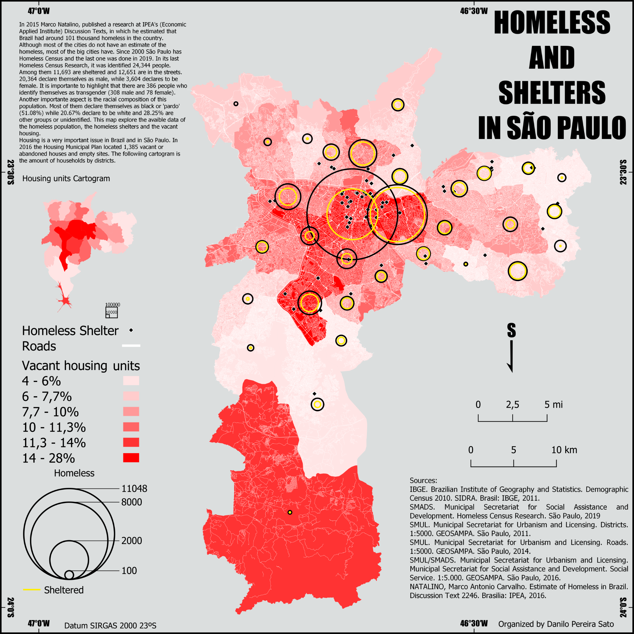
The first attempt combined only the homeless population (aggregated by districts), the roads, and shelters in the city. However, the vacant households in the city were a piece of very relevant information. Many scholars and activists have criticized the housing market, policies, the great number of empty residences, and other buildings that could be converted into houses. It is estimated that there is a housing deficit of seven million units, while there are 5.5 million underutilized properties in Brazil.[3] The vacant households’ information can be obtained in the national census, but it does not express all the housing potential, which can be greater through commercial building conversion to residential, and social housing construction on vacant lands. There are some numbers on the housing potential, although these are related to specific areas, such as the city center. The vacant housing was the best information available, so I recalled my experience as a researcher at the DASP in which the Brazilian Institute of Geography and Statistics (IBGE) methodology was applied.
During a census, all the residences are registered and classified, whether they are a permanent residence or for occasional use, occupied or vacant, etc. The registrations of households and their conditions were collected at IBGE's system SIDRA, a statistical and geographical database. Throughout this process, it was necessary to express the households’ total and percentage, as well as the homeless and sheltered total. The map was divided by the households in an anamorphosis map, while the homeless would be in a more Cartesian map, with the shelters symbolized as proportional circles. To link these two maps, the vacant percentage choropleth representation was the common element.

Anamorphosis map of households
There was also racial information that could be represented. To explore that information, it was necessary to split the information into more maps, which resulted in the following maps. The representations had the homeless population, the shelter localizations obtained in GeoSampa, and the racial distribution by district.
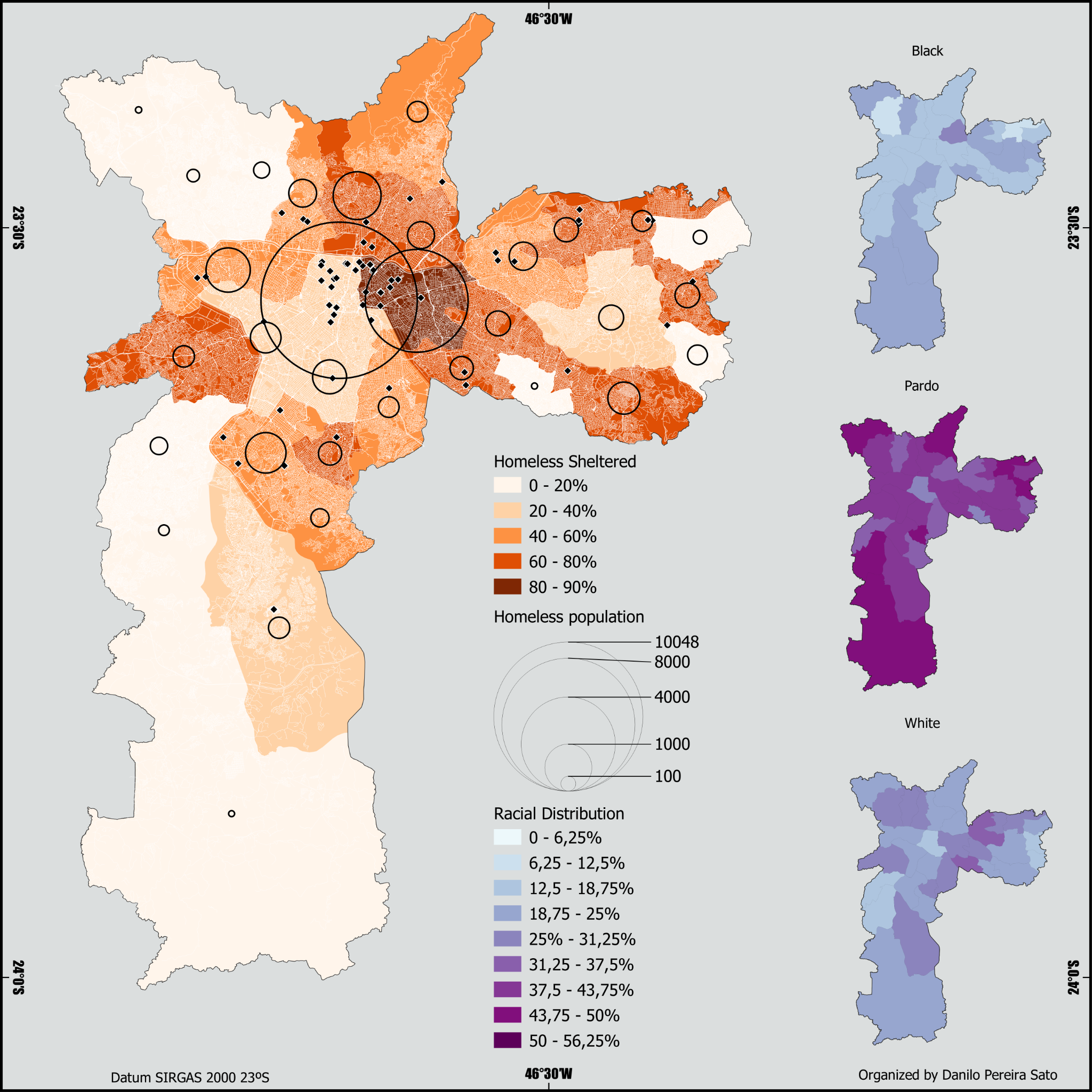
Racial distribution of homeless
Breaking down the information permits us to visualize the distribution better, however, as the drafts were done, the racial spatialization did not contribute much to the current analysis. The fact that 51 percent of the population is black or pardo[4] is more important than its spatial distribution. This data would require further research and discussion to be relevant before being spatialized. Considering these drafts and what data was available, the final map focused on the total population while the racial information was placed in the map introduction.
After the Guerrilla Peer Review’s feedback, the final map results in an exercise to explore from the semiologics of graphics perspective, combining the homeless, sheltered, public shelters, and housing information. It does not end all the potentials and possibilities that other cartographers and researchers can explore. Some aspects stood out and emphasized the inequality of São Paulo on the map, while others that are not on the map are very relevant for context.
References:
[1] http://www.iea.usp.br/:pesquisa/catedras-e-convenios/catedra-olavo-setubal-de-arte-cultura-e-ciencia/democracia-artes-e-saberes-plurais
[2] Rosely Sampaio Archela and Hervé Théry, “Orientação metodológica para construção e leitura de mapas temáticos”, Confins [online], 3 | 2008, uploaded 23 June, 2008. URL : http://journals.openedition.org/confins/3483 ; DOI : https://doi.org/10.4000/confins.3483
[3] Fernandes, E., “Implementing the Urban Reform Agenda in Brazil: Possibilities, Challenges, and Lessons.” Urban Forum 22, 299–314 (2011). https://doi.org/10.1007/s12132-011-9124-y
[4] In Brazil's classification, pardo represents a mixed-race population (mostly Afro descendants). The pardo category is a complex issue and reflects racial and historical-social relations, perceptions, and identities. This discussion is made by some authors as José Luis Petruccelli in the IBGE’s book Características Étnico-Racias da População: Classificações e Identidades (Population ethnic-racial characteristics: classification and identities) and Edith Piza and Fúlvia Rosemberg’s USP Magazine article Cor nos Censos Brasileiros (Colour in the Brazilian Censuses).