Sunken Cities

Foundation

Contributing an original map to GC’s newest Shelter: An Atlas was very appealing to me for a couple of reasons: One, as an independent map illustrator, it would give my work wide exposure. Two, it would put me in good company with other talented mapmakers. Suggestions for this particular project were “from housing legislation and homelessness to shelters of flora and fauna in nests, caves, tree canopies and under the sea; from historic house forms to psychological shelter.” It was the “under the sea” idea that grabbed my attention.

Inspiration

My Sunken Cities map idea came about in a rather unconventional way. I like to listen to ambient music when I create, and it was around the time of GC’s Call for Maps that I had stumbled upon a new album called The Spectral Isle, recorded by UK artist Mark Burford (recording under the moniker Field Lines Cartographer). Burford explained that the concept of his album was inspired by the legend of the phantom isle of Hy-Brasil.

Hy-Brasil in Petrus Plancius’s Orbis Terrarum Typus de Integro Multis in Locis Emendatus (Amsterdam, 1594)

Hy-Brasil in Petrus Plancius’s Orbis Terrarum Typus de Integro Multis in Locis Emendatus (Amsterdam, 1594)

Situated in the Atlantic, approximately two hundred miles off the west coast of Ireland, the island of Hy-Brasil was featured on maps from around 1325 until the mid 1800s. Legend has it that it was surrounded in mist, appearing only every seven years. It was long thought to be the home of an advanced mysterious ancient civilization.” [Bandcamp.com]

I had never heard of this legend before, but like the lost island of Atlantis, the story completely fascinated me. I was compelled to learn more about it, and I did, along with other mythical phantom islands, such as Antillia (Spain & Portugal), Baralku (Australia), and Aeaea (Greece).

However, because many of these islands were based in myth and folklore, and did not have precise geographic coordinates, I realized that plotting them on a map would prove rather tricky. There were, though, plenty of real islands and ancient civilizations that had been wiped out due to a cataclysmic event of one type or another. I thought this would make a very compelling and intriguing thing to map! I could plot various long-lost locations from around the globe and use them to illustrate a concept of shelter — how fragile and impermanent it is. And also how vulnerable human habitation is to the movements of land and sea. The message of my map would be: It doesn’t matter how large or fortified or long-lasting a city may be, every one, throughout human history, has ultimately yielded to nature.

Research

My first step was to take a census of the most well-known and/or prominent cities and settlements that disappeared due to natural disaster. There are plenty of resources on this topic, and I learned there were many! I knew my map would need to be a global projection, but plotting every lost city would prove unworkable. So I decided to include the most renowned sites, 15 in total. Investigating each of the sunken cities was like going down a rabbit hole, each of them leading me from one website to another. I was led ever deeper into journals and videos and expedition reports. The process of discovery was exciting for me — I learned about past civilizations, archaeological expeditions, cultural artifacts and ruins, plate tectonics, climate instabilities, sea level changes, etc. For each site I wanted to know the following information: 1) the name of the city; 2) the city’s location; 3) the estimated year it disappeared; 4) the suspected cause of its disappearance; and 5) the ruins or artifacts that had been discovered and when.

Slide 1.1.png

There were seemingly limitless online resources about each site, so I limited myself to five or six to cite the generally agreed-upon scientific consensus for each of these data points. I could have easily limited my map to the Mediterranean region, but I really wanted to use a broad brush and sample from around the globe. I decided to represent each location with a numbered circle (to correspond with the legend) and a simplified illustration of one thing that represented the lost city. Adding in tectonic plate boundaries was a last-minute decision, as I felt it would add to the story of how and why some of these cities had succumbed to earthquakes.

Process

With all my data compiled, I proceeded to plot each city on my Robinson Projection. I chose to crop the global map so as to exclude those areas not relevant to the plot points. Most of the sunken cities on my list were clustered around the Mediterranean Sea, one of the most complex, geologically active regions on earth. It took me multiple rounds of trial-and-error in plotting all the points and illustrations in this relatively small region in a way that was visually pleasing and understandable for the size at which this map would be printed. I found the use of arrows to be the best way to make clear associations between the icon illustration and the sunken city it belonged to.

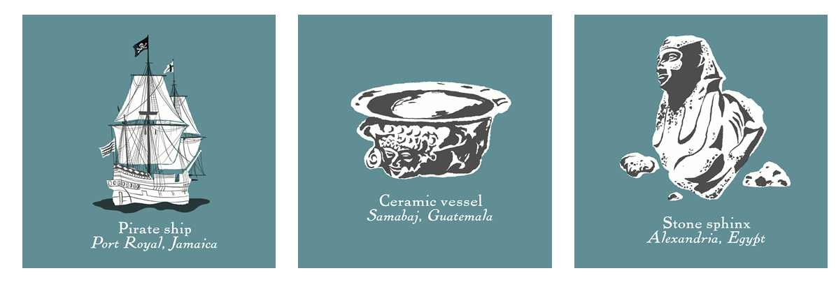
In another attempt to keep the map comprehensible and visually pleasing I chose a simple and muted color palette and traditional, unassuming typography. Due to their size and complexity, the illustrations needed to be very simplified. The artifacts or ruins which I chose to illustrate were those I found most commonly mentioned or photographed in my research. The only sunken city on my map without evidence of its existence is Atlantis. There is no agreement or documentation whether or not Atlantis was a real place, but I was compelled to include it because, well, no other sunken city of antiquity can compare to its mystery and mythology.

Result

My map went through many revisions but in the end it turned out pretty much as I’d envisioned it. I am very pleased with the final outcome. I do wish I had more room to show more sites and additional details, but I tried to include as much information as possible while not being too crowded or confusing. I hope my illustrations add an extra layer of interest and perhaps arouse an interest to further explore the mysteries surrounding these sunken cities.

Slide3.PNG

Shelter of Man

With the publication of Shelter of Man in Guerrila Cartography’s forthcoming Shelter: An Atlas, I can officially call myself a guerrilla cartographer. I’m not just an artist anymore. My relationship with cartography developed while studying architecture in Australia. I might have caught the antipodean point of view, and it became a habit. Australia and architecture influenced how my visual work responds to place and landscape. In a map, shelter is shown as integral with the earth’s surface. The built environment and markers of our habitat are geographical. It is wonderful to have discovered a niche for my work related to the view that architecture is a constructed map of human activity.

Study model for the site proposal of an artist retreat, composed of individual live/work pavilions and shared amenity (c.2000). Student work produced while studying architecture at the University of New South Wales during an on-site design studio at…

Study model for the site proposal of an artist retreat, composed of individual live/work pavilions and shared amenity (c.2000). Student work produced while studying architecture at the University of New South Wales during an on-site design studio at Bundanon (design tutors: N. Murcutt and A. Morandini).

“Dregs 2” is a work on paper reminiscent of scattered settlement and ways between places (c.2009). Private collection.

“Dregs 2” is a work on paper reminiscent of scattered settlement and ways between places (c.2009). Private collection.

The conceptual map Shelter of Man presumes that shelter is the human use of space that supports life. The work depicts settlement patterns of built form, occupied by humans and their activity. Shelter of Man uses orthographic views of plans and sections to show footprint and enclosure. Territorially, a footprint is an outline of claim and occupation. An enclosure shows the relationship between interior and exterior. Maps have legends that perpetuate some tradition of graphical lore. They are used as keys to decode a visual representation. In publication, the hand-hewn illustration Shelter of Man appears with alchemical symbols denoted by the words “time” and “scale.” I created this legend for a viewer to use toward their interpretation of the map’s content. The artist’s translation is:

“Legend tells that time precipitates and scale sublimates”

Gates blog image 3.jpg

In my creative process, making a map or plan begins with the subject space/area. Answering the question of scale is one of the first decisions. The conceptual scope should fit in the picture. The scale impacts the representation of detail and it frames a viewer’s consideration. I chose to illustrate Shelter of Man by hand. A physical medium requires more discipline because of the material limits of the page. A sheet of paper has a fixed size, so it restricts the content, which is measurable or quantifiable. Although the primary message of Shelter of Man is not about quantities, the spaces shown needed to clearly portray human use. Shelter of Man is the first work I’ve created with the intention to explicitly imply the daily activity of human settlement, without designing architecture.

 “Aunt Charlie” is a work on paper by the artist exhibited at the Dallas artist co-op gallery 500X (c.2009). Collection of the artist.

 “Aunt Charlie” is a work on paper by the artist exhibited at the Dallas artist co-op gallery 500X (c.2009). Collection of the artist.

I’ve mapped conceptual spaces throughout my career. In most of my art maps, I use relative position and scale of figures/shapes to proffer a narrative for the viewer. When I look at my own maps, I interpolate a visual order, and vicariously travel between the figures. In my art maps, I make annotations for an improvisational choreography of a viewer’s observation; this has to do with how a viewer’s eye moves across the page. I use line quality and pattern to allude to the perpetual phenomena between nature and human intervention. As an architecturally trained artist, I recognize that architecture is a pattern of occupation. I believe that at a greater scale this observation holds true. An urban form is, in a way, a map itself; it is a map of human culture. The creative progress is part of the visual folio at www.cathgates.com.

“Making Tracks” is a work on paper (c.2008). Superimposed plan and section views of natural and man-made marks. Gift from the artist. Private collection.

“Making Tracks” is a work on paper (c.2008). Superimposed plan and section views of natural and man-made marks. Gift from the artist. Private collection.

Site drawing showing the plan and section of a cave (1999). Site analysis. Student work produced while studying architecture at The University of Texas at Austin (design tutor, J. Birdsong).

Site drawing showing the plan and section of a cave (1999). Site analysis. Student work produced while studying architecture at The University of Texas at Austin (design tutor, J. Birdsong).

A map tells a story, just as an illustration does. An architectural drawing shows multiple views of one subject: elevations, sections, plans, rendering. Shelter of Man is a series of vignettes that depicts shelter or aggregates of shelter. The work shows multiple views for some of its subject matter. The vignettes invite a viewer to recognize the evolution of forms that are used to shelter. In the series, different scales are used to illustrate a pattern of social habitat. Each scale suggests a different density of human activity. The sheltering (urban) forms serve social function. The vignettes show either the footprint of structures or interior spaces.

The cave is remembered as an origin of shelter and the subject of the first diptych in Shelter of Man. A cave is an interior space that is protected from deterioration due to exterior elements. Shelter is this notion of a place that protects from the elements, where there is amenity for daily habit. The shape of shelter shows our advancement. Urban forms are tangible patterns of our social progress and adaptation. The composite of vignettes in Shelter of Man show differences of built form, singularly and plurally, alluding to different social developments. Shelter of Man addresses shelter and settlement. Settlement multiplies shelter, appearing as an imprint of growth. The sheltering habitats in Shelter of Man have different occupational densities and are drawn at different scales.

 “Shelter of Man” is a work on paper, a triptych of diptychs (2020). Diptychs from left to right: “The Elements,” “More Than One,” “Context in Defense.” Published in “Shelter: An Atlas” by Guerrilla Cartography.

 “Shelter of Man” is a work on paper, a triptych of diptychs (2020). Diptychs from left to right: “The Elements,” “More Than One,” “Context in Defense.” Published in “Shelter: An Atlas” by Guerrilla Cartography.

Urban settlement, the grand catalogue of shelter, is an aggregate of abstract marks that trace the impact of events. It has been said that “a map is a plan.” This has become a profound truth about maps and influential in my visual work. The best I can do with the thought is to see a map as both an end and a beginning. A map shows the outcome of past events and the starting conditions before the future. A plan has more direction than a north arrow can show. Time and scale are concepts that are relative to space and they substantiate place. The publication of Shelter of Man has validated my artistic application of architectural and urban subject matter.

Can You Stay?

Nicole White Shelter map.jpg

Can You Stay? examines one discrete variable among many complex and converging issues concerning housing precarity, focusing on a part of the world with unique geography and social issues.

Project Background

This map is cut from the cloth of a capstone project I did in 2018 at the Centre for Geographic Sciences (Lawrencetown, Nova Scotia, Canada), where students were required to develop a mapping solution for a third party.

A family friend worked as the director of the local women’s centre, and I asked them whether maps would be of any service to their work. As it turned out, they already had an idea in mind — the women’s centre had been collaborating with local housing coalitions and public health officials to produce a series of reports on housing precarity in southwestern Nova Scotia, a rural part of Canada’s east coast. These reports illuminated the reality that many working people are at risk of homelessness and examined why this is so in this part of the world. They’d been thinking for some time of employing maps to visualize the data and provide a compelling complement to their reporting.

White Blog detail map.jpg

Exploring the Data

The concept of housing as a social determinant of health was a relatively new idea to me. I imagine that in this pre-pandemic ‘Before Time,’ public health in general was probably a novel topic for many people.

Much of the report data came from a survey the participating groups had conducted, (http://www.daashgroup.com) asking respondents a variety of questions related to housing needs.

The voices of rural Nova Scotians express concerns of a tenor different from those of the precariously housed/homeless in cities or in other parts of the world. The survey was able to capture and quantify some aspects of this reality.

For example, let’s say it’s more common for a working-class person to own a home in Atlantic Canada than in Southern Ontario. It’s tempting to think a homeowner in Shelburne County is unquestionably better off than an apartment-dweller in the Greater Toronto Area. But what if:

·        They can’t get the firewood to heat this building they own?

·        The person lives a 60-mile commute from where the jobs are, and can’t afford car repairs this month?

·        Internet is murderously slow in their community, so they aren’t able to work from home?

Or maybe a Nova Scotian is unhoused, and while not sleeping rough on the street, visible to passers-by as might be the case in an urban area, they’re ‘invisibly homeless,’ perhaps finding temporary places to sleep on friends’ couches, tents on the outskirts of town, or a hunt-camp in the woods. This person’s needs might be quite different from those unhoused in a city.

Although the survey was anonymous and confidential, responses were linked to broad geographical areas within the study area, giving cartography and spatial analysis relevance to the project.

To satisfy my academic requirements, I created a series of posters and graphs to support this reporting. I presented my findings at a housing symposium held in 2019, which was attended by housing coalition members and decision-makers. Work done by these groups has helped to identify needs within our communities and inform new initiatives to help residents. (http://www.tricountywomenscentre.org/vibrant-homes.html)

Guerrilla Cartography Map-Making Process

When I first heard about Shelter: An Atlas, I was excited by the idea that, with a little reworking, my topic could perfectly dovetail into the project. I’m pretty sure I pulled together the initial draft of the map within one day of hearing about the atlas!

There were so many dimensions to the data collected. To narrow it down to one graphic for inclusion in the atlas, I chose a survey question that, while a simple yes/no question, struck me as weirdly trenchant: "Are you able to stay where you're currently living?"

I enjoy drawing by hand, but this is usually limited to little doodles during protracted Zoom meetings. At the time of pulling together this submission, I’d just gotten an iPad and wanted to experiment merging vector map graphics with digital sketching and painting, to create work that was technically precise but looked imperfect and hand-drawn. To accomplish this, I used QGIS 3 and Statistics Canada shapefiles to design the mapping, exported each layer to an image file, then redrew them in the Procreate iPadOS app. I recombined them and added a few additional effects using Photoshop.

In reviewing the housing survey results, the most compelling thing to me wasn't the statistics that could be gleaned from them (which I massaged, parsed, and merged with Canadian census data using Python to create more comprehensive reporting not included in this piece), but the narrative comments offered up by participants.

Southwestern Nova Scotia’s communities are relatively sparse in population, and although the survey received enough responses to render it suitable for statistical analysis within broadly delineated geographical areas, the dataset was still small enough that individual responses stood out as unique voices in ways that just weren’t eligible for use in data science or as cartographic visual variables.

In the science-based reporting style I’ve been trained in, we're encouraged to disregard subjective data and anecdote. However, I think this sort of qualitative data can greatly enhance reporting, especially with respect to social issues. Individuals who are experiencing first-hand the issues of study can advance our knowledge with more credibility and authority than those whose understanding is theoretical. So I was enthusiastic about including the text of some of these comments in the mapping.

White Blog author photo.jpg

People can understand these situations more readily when hearing the first-person perspective, connecting the data to personal storytelling. The hand-lettered quotes on my map from survey participants, in addition to matching the unfastidious aesthetic I chose, are intended to make viewers aware that they’re reading comments written by actual people.

About the Cartographer

I do GIS analysis and database work at my day job, but I value the use of cartography untethered from strictly commercial applications as a form of expression and a source of transformative knowledge-sharing. So I also make a point of using my skills for solving spatial problems in support of environmental or humanitarian work, by creating fine art maps to support grassroots fundraising initiatives, and always following mercurial paths of creativity to see what comes of it. Despite having zero university degrees, I try to keep an eternal student’s frame of mind, and I’m currently experimenting with graph databases, natural language processing, and digital painting.

Free Spirits

Free_Spirit_3_desat .jpg

There are strange happenings in dusty, old, forgotten small towns on the border of nowhere. Particularly when the end of October draws near. Sightings. Strange lights. Spirits. There are always spirits. I live in such a place. Me and my dog Jazz.

“Jazz,” I said, “it’s that time of year again.” She wagged her tail. I could have said the end of the world was happening tomorrow, and she would have wagged her tail. The beauty of a dog’s spirit, a tail wag of joy no matter what. We were walking the old town streets as we always did, enjoying the cool, crisp air of fall.

The yellowed leaves of the ancient Cottonwood tree were swirling in the wind and piling up along the curbside. As we passed by the old Copper Pick Hotel, a long, abandoned establishment right in the middle of main street, we saw her through the broken glass of the second-floor window. A pale, translucent girl, shimmering in the fading afternoon sun. Jazz gave a short bark, and she faded back into the darkened room. There are many wandering spirits in this town. After all, everyone will find their place eventually. One year a tourist dropped of a heart attack right where we were standing. Our shimmering girl, we call her Molly, had that effect on those who fail to believe in the reality of the world.

Our town is an old mining town. The mines closed decades ago but the town stayed put. We still live in the same old houses the miners used over a century ago. In that amount of time, spirits and legends and stories just accumulate. Ghosts, goblins, and spirits abounded. College kids come down from the cities to dare each other to challenge those entities. Truth be told, some never return.

It was getting a little chilly, so I ducked into the old saloon for a warm-up. We sat at our usual stools, Jazz perched on the stool next to me, stretching to try to reach my cracked bowl of pretzels. I slipped her a couple and got a wag. The saloon was its usual dark, musty self, with a sense of a century or more of wild times.

“The usual?” asked Joe, the bartender. I nodded. He set a dripping mug of brew in front of me with a shot glass of questionable liquid. He liked to surprise me.

“So, what’s new, Joe,” I asked.

“Another television crew,” he said, “here we go again.”

“Ghost hunter-type guys?” I said.

“Yep, non-believers. Going to debunk the whole thing.” We both laughed. “In fact, here comes the director of the show right now.” A tall guy, wearing a suit, plopped down on the stool next to Jazz. She barked once. I nodded at her.

“Is this the guy?” he asked Joe.

“Yep.”

He introduced himself to me. He was one of those Hollywood types. Perfect hair, tan and clothes and a soft handshake. I did not care for him right away, but he launched into a kind of interview, or maybe actually an interrogation, of my views as an old resident regarding the rumors of ghosts in town.

“I know the stories bring down the tourist dollar,” he said, “but frankly, I’m here to prove there’s a logical explanation for all the hype.”

“Actually,” I said, “there really isn’t any hype, as you say, it’s just our town.”

He had a skeptical look. “I’m told you’re kind of the authority around here on these legends.” I glanced behind the bar to see Joe stifling a laugh as he winked at me.

“Yeah, that’s me,” I said. Joe choked down another laugh behind the bar. “Where do you want to start?” I asked.

“I hear there’s a so-called apparition at the abandoned hotel. I’d like to film it if it really exists,” he smirked.

I liked him even less. “I’ll be sure to tell Molly to wait up for you, though she doesn’t really like being called an ‘apparition’,” I said.

“Ghost, goblin, boogey-man,” he said with a sneer.

“Spirit,” I said, “no need to be rude.”

He gave me a weird look. “I can see I’ll get no help from you,” he said, and got up to leave.

“It’s been a pleasure,” I said.

I heard later that after failing to film any sign of Molly at the hotel, they moved on to the mine opening and found something. The ‘old miner’ spirit was said to guard the shafts under the mountain from evil. He was quite a scary spirit, but also known to lure skeptical humans into the labyrinth of mines. We never saw the film crew again. Maybe they just fled back to Hollywood.

Joe and I got a good laugh a few days later.

“He could have just shot some film right here and been famous.” “Yeah,” I said, “Three spirits right in front of him and he was too wrapped up in his own reality to see in front of his own nose.”

Jazz barked once from her stool. Wandering spirits, all of us. I gave her a pretzel. She gave me a wag.

To the wandering spirits of our town, this is our heaven.

Text by Jim Driesen, map by Sarah DorranceDedicated to Jazz – rest in peace – may your spirit wander freely in Old Bisbee!

Text by Jim Driesen, map by Sarah Dorrance

Dedicated to Jazz – rest in peace – may your spirit wander freely in Old Bisbee!

Bangalore's Disappearing Lakes

Final_Brownstein_LeNoc_Bangalore_wLogo.jpg

In an area of pronounced water scarcity high on the Deccan plateau, at an altitude removed from river-water and of water extraction from the ground, despite being historically nourished by monsoons, Bangalore's current population faces deep inequities of access to water which are difficult to capture in data or adequately convey. The map I drafted with cartographer Maël Le Noc charts the story of the city lakes that have gained attention of environmental science, in public-private schemes, neoliberal programs, and community movements, framing the meaning of access to the lakes in a Guerrilla Cartography that begins from the ground.

Bangalore’s Disappearing Lakes maps the centrality of water in the city’s physical and spiritual landscapes, and how these landscapes are historically connected. Prepared for Guerrilla Cartogaphy’s Water Atlas, the map combines three information layers, which are often separated in maps of water scarcity, to describe changes in an urban landscape that was once rich with water, but is now under the huge pressures of climate change and population growth. These layers are landcover change, vanished and compromised lakewater, and religious processions that celebrate a city once boasting a “necklace of lakes.” Together, these three layers track an existential rewriting of human relations to water.

The rainwater-dependent lakes, built in the sixteenth century, were long a basis for neighborhoods, and were maintained by resident custodians who inherited the office. Minimal urban oversight or regulation on development, however, encouraged an over-paved city, compromising the often-seasonal network of lakes, which were formerly connected by underground canals in an artificial watershed, and removed them from groundwater recharge. Bangalore’s rapid expansion has challenged local hopes for environmental restoration of walled tanks and miniature reservoirs, which began in the early 2000s. A crisis of drinking water, stench of refuse, and industrial pollutants place problems of local restoration on Bangaloreans’ front plate.

Modern Bengaluru (aka Bangalore) today faces many forms of water stress — soil subsidence, water pollution, flooding of residential neighborhoods, poor infrastructure, and difficulties of water distribution. Poor environmental safeguards have let surviving lakes foam over with industrial byproducts that rise onto their surfaces or combust in flames, and their catchments are greatly contracted by residential expansion and landcover change. Still, it remains difficult to obtain accurate public data on the purity of water or water safety, the precarity of drinking water supplies, and groundwater and urban pollution.

In the context of a broad crisis in groundwater supplies across India — Bengaluru, Delhi, Chennai, and Hyderabad are poised to exhaust water supplies by 2020 — the lost landscape of lakes poses poignant problems in this plateau city removed from rivers, whose early rulers long relied on tanks to harvest water for agriculture. Most of the larger lakes exist outside the city center, and most of those are polluted by untreated sewage or industrial run-off.

“Bangalore’s Disappearing Lakes” maps the filled-in and polluted tanks used for rainwater harvesting (each shown by a marker evoking mourning of their loss) against a ritual procession, called the Karaga, which links sites of traditional tanks in the increasingly paved center of this South Asian megacity. The lakes orient the Bengaluru Karaga procession, held each year at the first full moon of the Hindu calendar. The procession links a religious diversity of Hinduism in Karnataka Province — including Bhakti and Vedanta Hinduism — with Muslims, Buddhists, Jains, Thigala, and Christians. This urban ceremony transcends religious divides by uniting the city around a shared symbolism, tapping public memory of a past geography of lakes that recalls a lost centrality of water in the city, of lakes long used by cleaning people, for laundry washing, and by fishermen. Will this ritual survive the encroachment or disappearance of once-healthy water bodies and paving of lakebeds?

The map-making process

Uniform data, whether on water pollution, or on lake-use for washing and feeding cattle, fishing, and clothes washing, or on religious celebrations at lakes, was sadly difficult to obtain. Lake-loss became a proxy to trace a shifting relation to an urban space where tanks held monsoon water in Bangalore’s celebrated “necklace of lakes.” The current lakes — or tal — are sites of an agrarian past, with fifty “healthy” tanks peeking through the paved landscape as historical vestiges; the shallowest lakebeds, like Sampangi Lake, barely exist today. Projects to pipe water from the Cauvery River, 100K distant, via pipelines to urban reservoirs below the plateau city, cast the lakes as an unwanted agrarian inheritance.

In an area of pronounced water scarcity high on the Deccan plateau, at an altitude removed from river-water and of water extraction from the ground, despite being historically nourished by monsoons, Bangalore's current population faces deep inequities of access to water which difficult to capture in data or adequately convey. The map I drafted with cartographer Maël Le Noc charts the story of the city lakes that have gained attention of environmental science, in public-private schemes, neoliberal programs, and community movements, framing the meaning of access to the lakes in a Guerilla Cartography that begins from the ground.

We hoped to map the performative relation of urban residents to this landscape by the route of the annual Karaga, a procession that affirms the continued identity of the city even in the face of the drying of its environment. We began with the problem of mapping water scarcity, but were attracted by data-maps of lakewater and landcover that track a human story of drastic landscape change, which were mapped in detail by the Centre of Environmental Studies in Bangalore. This national organization is charged with monitoring environmental management, mapping lake loss as a crisis of urban overdevelopment.

Temporal changes in lake-water, greenspace, and land-use, in Bangalore: Land Use Dynamics, figure 3.2. (Courtesy T.V. Ramachandra, Energy and Wetlands Group, Indian Institute of Sciences)

Temporal changes in lake-water, greenspace, and land-use, in Bangalore: Land Use Dynamics, figure 3.2. (Courtesy T.V. Ramachandra, Energy and Wetlands Group, Indian Institute of Sciences)

Rendering cumulative lake-loss in one map, we evaluated how best to map the human relation to the tragedy of declining quality of bodies of water once designed for rainwater harvesting. The waters stored in the tal of early modern Bengaluru contain a deeper spiritual meaning, following the Punjabi Rig Veda’s personification of water, orienting believers to “help us find the life force.” The Bengaluru lakes were personified as sites of deities in the annual ritual of the Karaga procession, in which all the city’s faiths partake.

The Karaga begn with a ritual immersion in Bellandur Lake, then proceeded to visiting fragmentary lakes as sites of worship, veneration, and human contact with the divine. Among a graveyard of lakes and obstructed, polluted impounded canals, we mapped a prominent red ring at the city center, activating a deep history of the tanks, in the face of a broader regional crisis of groundwater supply, evident in dried urban lakebeds.

In early modern Bengaluru, the tal had responded to a tremendous series of droughts, and we map the disequilibria of these man-made bodies of water as a condensation of the problems of global warming. The tal are valued by multiple faiths as sites of contact with and access to sacred renewal, even in an era of radical water scarcity. These trenches of land, impounding water for year-round supply, and once the structure for husbandry, washing, and drinking, were also sites symbolizing rejuvenation, reminding residents of the biological reciprocity of the lakes, the annual rains, the lived environment, and the nourishment of the city.

In ways that LiDar or GoogleMaps georeferencing cannot record, we map the lost lakes from a humanistic perspective that compliments but also goes beyond records of the quantitative loss of water bodies or acreage of water. Despite limited data of the loss of such sites of rainwater retention, a historic baseline of 262 lakes — of which 46 were eradicated — remain the waypoints for expressing public devotion during the still-vibrant annual ritual of Karaga.

The procession presents a counter-map of the draining, pollution, and paving of lakes once central to urban life. The annual devotion to the lakes at the first full moon of the Hindu calendar occurs against a backdrop of vanishing lakes and tanks, affording a restoration of human-sacred relations of cosmological import in the face of global warming and endemic drinking water shortages. Lake sites still provide access to the divine, even as recently urbanized areas on the periphery have become polluted with industrial effluent, domestic waste, and runoff.

With urban development, the paving of lakes in central Bengaluru transformed a landscape rich with water into one threatened by flooding, pollution, and disrupted ecosystems. The crisis of water created by limited groundwater compromised urban residents’ historical relation to an interlinked system of lakes that now regularly overflow, shrink to bogs clotted with weeds, and where flammable industrial runoff regularly catches fire. From the 1950s on, impounding the monsoon water was seen as an atavistic survival from an agrarian, non-modern past. The catchments were drained, and were repaved for public spaces as stadiums and bus terminals. Fewer walled tanks, long repositories of domestic water, dried an urban center; these are rendered in the map in warm oranges and yellows.

The map illustrates the increasingly tenuous place of such bodies of water in the modern city. We reveal the accelerated disappearance of the lakes in the once-irrigated city with geolocated ‘x’s. We opted not to trace a trajectory of historical transformation of the city’s irrigation system. We wanted instead to suggest the once-plentiful sites of access to the sacred in the city’s delicate ecology, and the fate of lakes in a built environment by the possibility for their ritual survival, and how those lakes continue to serve as access to the divine, even as their volumes and purity decline.

We questioned whether shape-files satisfactorily depicted water bodies, registering on Google Earth as of 2016 by a uniform bright blue, without noting effects of increased domestic and industrial waste or the overbuilt setting.

Distribution of lakes within and surrounding Bangalore. Note the lack of lakes in the city center, indicating their encroachment and conversion to other land uses (Prepared by and published with kind permission of © Harini Nagendra 2012. All Rights …

Distribution of lakes within and surrounding Bangalore. Note the lack of lakes in the city center, indicating their encroachment and conversion to other land uses (Prepared by and published with kind permission of © Harini Nagendra 2012. All Rights Reserved) (https://link.springer.com/chapter/10.1007/978-94-007-7088-1_7, fig 7.2)

By designating vanished lakes regardless of size by a simple ‘x’ we map the loss of lakes against urban growth.

As we enter the twenty-first century, overbuilding of the urban center with impermeable landcover has obscured Bengalureans’ relations to the sacred cycle of monsoon rains, which situates the annual Karaga ritual. The continuation of this procession, in a celebration of water’s abundance, juxtaposes the subjective experience of the festival in the urban center against the disappearance of its lakes. The annual ritual of Karaga proceeds in a fixed route as if to reconstitute the lost “necklace of lakes” for which the city is historically celebrated. We lend centrality to Karaga in our map by bright red, to suggest the vitality of the annual procession in which much of the city participates. Among a graveyard of old and obstructed lakes, trenches of land once refilled by monsoons, we map a prominent red ring at the city center as activating a deep history of water in an ecosystem of seasonal rejuvenation.

Route of the Karaga procession

Route of the Karaga procession

We provide local context through inset views on the map of three sacred lakes. Views of two of the more aestheticized urban lakes — Hebbal Lake and Bellandur Lake — reveal their dramatically reduced size and an almost entirely reduced bed of Sampangi Lake. These views point out radical constraints on water reserves, which had long been points of urban orientation, habitats for a huge variety of birds, and a respite from heat.

Bangalore’s lakes’ shrinking surfaces are often mapped against increased pollution, clotting by sediment and weeds, lowering water table, or decreased habitat. As Guerilla Cartographers we chose to focus on the public spaces lakes still offer — places that long defined the commons and the sacred.

In the Karaga procession, we see resistance to a decaying infrastructure. Against a grim image of the dearth of lakes that were overbuilt with urban growth, sites of vanished or diminished lakes retain considerable significance. Red dashes in our map situate the Karaga procession among lakes, even as unregulated urban expansion makes inroads into lake catchments. The map explores conundrums that citizens face, orienting themselves to an increasingly lake-less landscape and compromised spiritual landscape in the former Garden City. We imagine celebrants moving between surviving, reduced, and vanished lakes, creating meaning in an increasingly over-paved city, amidst shrunken lake catchments where the physical contours of the lakes are continually redesigned as unsupervised construction proceeds.


Love Letter Back Home

Ollivierre map1.jpg

Mapped October 5th, written December 2019:

As I noted in my last Guerrilla Cartography Cartographer Spotlight (May 2019), my career has been a diverse mix of my two professional passions, cartography and participatory mapping. Cartography is about the place; it’s top-down, it’s authoritative, it’s scientific, and (as you shift from GIS to cartography) it’s artistic. Participatory mapping is about the people; it’s bottom-up, it’s representative, and it’s a form of intimate cartographic collaboration. The balance of these two decidedly distinct types of mapping is where I see myself fit as a guerrilla cartographer.

As a cartographer who works three jobs and finds it difficult to find the spare time to make maps just for fun, I was excited to help brainstorm what turned into the #CreativeCarto movement founded by the amazing Vanessa Knoppke-Wetzel. #CreativeCarto is the response to “I NEVER HAVE TIME to try out/learn/create,” and is for all the projects you want to work on, but just can’t seem to make the time for. It’s been a really great initiative to help hold ourselves accountable with a set monthly time to work on a fun and exciting map. Once Guerrilla Cartography posted about the Atlas in a Day project, I knew it would be a perfect project for October 2019 for myself (and I even got a few other #CreativeCarto friends on board!).

As soon as the topic for the Atlas in a Day was announced as “Migration,” I started browsing through James Cheshire and Oliver Uberti’s Where the Animals Go: Tracking Wildlife with Technology in 50 Maps and Graphics and diving into the MoveBank dataset looking for data that struck my interests, as well as was available for download. I found the data by Ron Efrat, Ohad Hatzofe, and Ran Nathan from their research titled: “Landscape-dependent time versus energy optimisations in pelicans migrating through a large ecological barrier” particularly interesting as a bird nerd/conservationist (who had also lived in Egypt over a decade ago).

While the dataset was way too large to work with in its entirety (it crashed my software multiple times!), I pulled out four of the more interesting, individually tagged pelican migration routes to visualize on my map. I then worked with Natural Earth data for my basemap in Adobe Illustrator + Avenza MAPublisher to design my map. I was particularly inspired by Cheshire and Uberti’s use of connecting the colored lines/points on the map to little silhouettes of the animals in the form of a key. That’s probably my favorite part of my map, so shout out to my fellow cartographers for the great idea.

Pages from Where the Animals Go, featuring elephant (p. 37) and otter (p. 107) silhouettes as map keys

Pages from Where the Animals Go, featuring elephant (p. 37) and otter (p. 107) silhouettes as map keys

Unique to this mapping process for me was the short timeline from start to finish. I always appreciate being able to put down a map and come back and look at it with a fresh set of eyes, so it was difficult to finally hit send on the map, knowing that there had to be things I would still change if I could just notice them that second! I also would have loved the time to add more land cover data in the background of the map, such as I did after the map was published.

First draft of Great White Pelican migration map

First draft of Great White Pelican migration map

Despite being too much of a perfectionist to want to do this on a regular basis, the Atlas in a Day project was a great collaborative exercise that I’m sincerely glad I participated in!

Special thanks to Movebank for making this incredible dataset (and many others) publicly available.


 Mapped May 16th, written December 2020: 

When I participated in the next Atlas in a Day, I tried to take it a little bit easier on myself and map someplace I knew really well, instead of a country (Egypt) where I’d just studied abroad a decade and a half ago! For this challenge, with the topic of “Community,” I decided to map my hometown, where I attended preschool, elementary school, middle school, high school, and college (not to mention where I returned to get married!). I’ve mapped Middlebury, Vermont extensively over the years — as it was a common focus of our GIS class assignments in undergrad — but I hadn’t mapped it since I made my wedding invites.

2010 Middlebury Map for Undergrad Cartography Class

2010 Middlebury Map for Undergrad Cartography Class

2017 Middlebury Map for Wedding

2017 Middlebury Map for Wedding

I spent the first part of the day going through the old data in my GIS Data folder and reviewing it carefully for changes to the town and campus over the past decade. Major changes that I had to digitize new data for included the roundabout in the center of town, a few small housing developments in town and dormitories on campus, and the new field house on campus. (I’m sure I’m not alone in half-believing/wishing my hometown to be “static” or “stuck-in-time” whenever I’m not home!)

I then worked with my normal cartographic workflow of Adobe Illustrator + Avenza MAPublisher to design the map, using color swatches pulled from the Middlebury College website. I made sure my map extent included (almost) all of the houses, schools, and local establishments (Ilsley Public Library, Town Hall Theater, etc.) where I spent the most time during the two decades this was my permanent address.

Ollivierre map6.jpg

This map does not try to be anything in particular for the community, it’s just my way of sending a love letter back home!

Maps Without Words; Words Without Maps

Ant Community.jpg

During the early period of my self-isolation in Arizona, USA, Guerrilla Cartography put out a call for maps that represented “Community,” to be completed in 24 hours. Along with the call for maps, GC offered and organized free online talks, which included various and interesting cartographers from around the world.

One of the things I appreciate about GC is that there was no expectation that every map-maker would be available to watch, but that all and more are welcome. 

Whether in person or online, these talks, for me, have been the most important part of learning my personal process, and have encouraged me to make maps on the fly. I can’t really explain even to myself why these talks matter so much, except to say that with particular speakers, and with each talk, I am especially moved by at least one of the cartographers and the initial idea for my map changes radically. 

The cartographer whose talk immediately captured my interest and moved me most during the Community talks was Annita Hetoevehotohke’e Lucchesi, with a phrase from one of her maps, “with family from around the world.” I love the feeling and the visual image that “family from around the world” brings up for me, and this is just one example of her use of language that I feel in my brain. When she said, “a map needs no words,” she removed the “rules” from my personal known and unknown map-making and map-reading. I was freed to create, and I knew immediately what I would do!

The goal for the rough harvester Formicidae Ant map, after hearing Annita speak, was to communicate with as little written language as possible, using symbols to communicate the Ants’ message.

I began the map about the rough harvester ants and ant hill that I had been watching for the last couple of months, observing the ants travel from the nest to the unknown. Though not a word-free map it is the beginning of a concept I have been tossing about all of my life: communication without words. 

Annita not only helped me formulate the Formicidae Ant map’s message of Community, but also furthered much of my other work along. The pandemic has provided time for ant watching and GC community thinking, both important tasks that add to my solitary moments. As a Guerrilla Cartographer I see myself as an individual and as the group, similar to the ant. I make maps as a Guerrilla Cartographer and within Guerrilla Cartography.

One of the wonderful parts of being a Guerrilla Cartographer is the seriousness and importance of map-making. If you are making a map up in your head, you must say so. If you are recreating a map you must cite. During the process of almost making a ‘map without words,’ I realized that I too would soon be traveling, from a place known to me, to a place I knew prior to Covid-19; a human ant, and decided to record this journey as ‘words without maps.’

Inscription at the top of our stairs, Bisbee, Arizona

Inscription at the top of our stairs, Bisbee, Arizona

As I moved from one place of self-isolation to another place of isolation, I recorded the interactions, and sometimes nameless places, along with my personal communities in between. I think it important to share from my perspective, as a member of the Guerrilla Cartography community, what a fortunate car traveler might expect on a lucky, but stressful trip in the USA from south-eastern Arizona to northern California.

Generally, writing comes easily to me, but this time, the writing became difficult, because the trip was difficult. 

Fremont Cottonwood trees along the San Pedro River, Arizona

Fremont Cottonwood trees along the San Pedro River, Arizona

I leave south-eastern Arizona a bit before 9 a.m. on a quiet and cool Friday morning. Packed with a tent, food and drink to share, we and our dog fill the car. The plan — our Covid-19 travel plan — is to stop for gas and at rest stops to pee and let our dog out, and then to camp in our friends’ yard or driveway along the way and share socially distant meals. My dog is sick and an elder; this does not make the trip fast, as we will make many stops for her.

Jazz, canine companion

Jazz, canine companion

As we are pulling past the orange cones on the left, moving towards the Stop!, I look over to my right and I see a young Latina in the back of a green and white border patrol truck. I am struck that she is held in the back of a truck. We both have many feelings, no words are needed. I see her eyes and her face, she does not wear a mask. She is a woman, I was that age once. She sees only my eyes, I wear a mask. She leaves her face blank, she knows I have concerned feelings for her.

There is a car in front of us. We are urged with moving arms to keep rolling forward, and a bit further I see a young man, only his body, his face is not in my view, an agent is taking his personal possessions and putting them into a clear plastic bag. I wonder if the young man will get his items back, and in a quick second I realize I do not believe he will. In my mind, if he were going to get his possessions back he would not be held in the back of a truck, is my personal opinion.

The agents want us to quickly move on. I later assume they don’t want us to witness them holding humans in the back of trucks. 

We roll the window down an inch or so; Covid-19 allows us to be less than polite. We are asked a question, then we are waved quickly through. I have so many terrible feelings that I don’t notice if the Border Patrol Agents are wearing masks, something I never miss, as it is quite telling. They illegally ask if we are US citizens, my partner responds yes. We do not need to answer the question of residence, is all I say. After we leave, I give vent to my feelings and thoughts.

This is the beginning of the word map of our Covid-19 relocation from self-isolation to a different self-isolation. I see the woman’s eyes, her face, her shape for the remainder of our drive; even as I write this blog I see her. I am humiliated by my government and my own lack of action. I had no plan for this. This story is the beginning of my plan.

Stops for gas in Arizona and California are made easy if you have a credit card or debit card, if not, you must go inside to pay. Gas stations and rest stops on Interstates 8 and 5 are very busy. Not every Rest Stop is open and not all have facilities/toilets, but those that are open have many people and sometimes lines to use the toilet. Arizona has many and frequent rest stops, many in California remain thoughtlessly or thoughtfully closed.

When we use the toilets some people wear masks, some do not. It is always a surprise when folks do not, I always wear a mask. I find nothing visually that obviously connects masked or maskless people to each other, but either way, a group is chosen.

Rainbow over road, Arizona

Rainbow over road, Arizona

Soon after leaving Yuma, Arizona — my hero Caesar Chavez’s birthplace — there is a California border stop. This stop has two lines to choose from. We choose the long-winded agent’s line and wait anxiously for quite a bit of time. I notice the other agent waving folks through and glancing at his counterpart as we wait. I amuse myself and quietly talk under my mask during our wait.

We drive about nine hours with many stops in between to San Diego, California, arriving about 6 p.m. We spend two nights urban camping in our friend’s long driveway and eating shared, but distant meals in their backyard. We walk far apart with masks in their San Diego neighborhood and buy books that are in the window of their favorite book store, without leaving the sidewalk. 

One of these best friends was born in Mexico and is married to an American who is also our best friend. A relative of theirs drives a semi-truck and travels between Tijuana Mexico, as far up the west coast as Washington State, USA. He recommends leaving San Diego by about 8:30 a.m. Sunday morning to miss the Los Angeles, California traffic. We do, and had little traffic the entire drive.

Heron flying over the Birdhouse Ranch, Livermore, California

Heron flying over the Birdhouse Ranch, Livermore, California

We arrive at Birdhouse Ranch at about 3:30 p. m. the same day, about a seven-hour drive. The ranch is located about 45 minutes, southeast of downtown Livermore, California. We do chores and eat ranch raised Criollo beef for dinner and then again for breakfast.

Calves traveling, Birdhouse Ranch, Livermore, California

Calves traveling, Birdhouse Ranch, Livermore, California

We pop up our tent, it is the full moon or almost the full moon, we spend the night and wake surrounded by young quail. We have a breakfast that seems less distant and a bit more like camping with friends, but is still distant and everyone realizes we must remain distant.

We leave mid-morning after eating, and have very little traffic coming into the City, San Francisco, California, USA. We arrive at our destination in less than an hour and a half.

Walking into our house after having self-isolated in southeastern Arizona for months is another story entirely. 

San Francisco skyline

San Francisco skyline

Postscript: sapere aude (“dare to know”) — Immanuel Kant

I have since made another trip to southeastern Arizona, another 2020 transition. Early Thursday morning, in late December, we drive from northern California, USA; it is relatively uneventful. Since we last traveled to and fro, our ailing canine companion has died, she was 12 years old. And as we drive, I make jokes and we laugh about how many fewer stops are needed. And then I cry, quietly, as does my partner.  

There are still very few rest stops with toilets open in California. The gas stations are not as busy, with some maskers, some maskless, easy to be unnoticed either way. I always wear my mask.  

The drive from northern to southern California with no dog takes eight hours, with fuel stops and a couple of rest stops. There’s some slowing in Los Angeles but traffic is mostly smooth and relatively quick. The California checkpoint is not open, but the semi truck weigh stations are open and backed up, not a usual sight.

 Our stop in southern California is always in San Diego, with long-time friends. We eat outside distantly, sleep in our tent, we do what we expect, just as the neighbors expect us to. We spend only one night. I wake during the night to many military helicopters rumbling overhead. As we drive the next day, I can find no information as to why so many helicopters were needed on such a cloudy middle-of-the-night. Even before Covid this would have been unusual and unnerving, and I wonder why.

 Our internal checkpoint is Yuma, a military town. There are very few Border Patrol trucks at the stop or on the roads, also unusual. There are still some trucks off the road, but far fewer. The Yuma Arizona Border Patrol Immigration Checkpoint feels less tense, everyone wears masks; we are casually waved through.

 Of interest whether you are a masker or maskless, Arizona voted for Biden/Harris, Democrats not at all usual, first time since Clinton’s 1996 win, a major shift. Plus, marijuana was legalized in Arizona in 2020, and dispensary sales become legal April 21, 2021, but I am sure with many rules. The Tucson Weekly, December 17, 2020, has a good article about the rules, “sapere aude, dare to know.”

 On a trip to Tucson through the south-eastern Immigration Checkpoint, the guard wears a mask, he looks into the back of our car filled with camping gear, and dares to ask if we are citizens. We mumble with our masks on, he wishes us a good day. 

 The day after Christmas, December 26, the Immigration Border Checkpoint is closed. 

 New Year’s Eve day, December 31, a year I look forward to the end of, the checkpoint is closed.

 January 1, 2021, New Year’s Day, the border is open. 


Myopia: Observing Communities in Chiang Mai, Thailand

chiangmai-maps-2-outlines.jpg

The genesis for “My Parallel Communities of Chiang Mai (ชุมขนคู่ขนานที่เชียงใหม่)” likely began on a calm, wet-season night after the rains had subsided at One Nimman, my group of friends — portrait artists from Chiang Mai University — shooting the breeze and hustling what money we could from the few remaining Chinese tourists. Or perhaps it happened two years prior, on a Friday night in the packed living room of Healing House, in between energetic performances of freestyle rap and poetry from backpackers and drifters alike. At both I stop and ask myself, “Where are the other foreigners?” or, “Where are any Thai people?”, respectively. After having lived in Chiang Mai, Thailand for four years, it gradually became apparent to me that despite this small city’s dynamic cosmopolitan appeal, a clear division exists between the foreign expat communities and the Thai communities — and I found myself split between them.

View of the central district of Chang Moi looking west towards the Old City and Doi Suthep mountain in the background.

View of the central district of Chang Moi looking west towards the Old City and Doi Suthep mountain in the background.

Buried somewhere in cumbersomely translated academic texts* from Thai to English, a folk legend holds that Chiang Mai, settled by one King Mengrai in 1296 upon the floodplain of the Ping River beneath the imposing Doi Suthep (literally, Great Spirit Mountain), was bestowed with an astrological sign of “merchant” early in its history. Whether or not there is any historical validity to this claim isn’t so clear, though it certainly fits snugly into the narrative the city would like to espouse today. Throughout the years, the city has consistently attracted artists and intellectuals of various types from around what is today Thailand as well as further afield. In additional to its long-standing reputation as a traditional crafts center (it was honored with UNESCO Creative Cities status in 2018), the city is renowned among international traveler communities as a haven for the contemporary arts, as well as an affordable and cushy “hub” for expat communities: hippies, digital nomads, missionaries, and diplomats, among others. Thais, too, revere the city, and though Bangkok remains unquestionably the primate city of Thailand, Chiang Mai is the beloved “younger sibling” of the North, attracting students and young creatives from all over the Kingdom for its lifestyle and opportunities.

Despite this cosmopolitan nature, these communities — one predominantly Thai, another predominantly (Western) expat — are not well connected. In the interest of setting aside generalized remarks about language barriers between the two communities, I believe that the disparity between the two groups stagnates the development of Chiang Mai’s artistic community overall and undermines its true potential. For a city relatively small and overshadowed, it’s a wonder how thriving it is to begin with. Cultural cross-pollination can be one of the keys to dismantling some of the harshest social challenges we deal with, and Thailand — particularly Northern Thailand — is a stable, inviting, and most of all nourishing neck of the world. One would hope this city could be petri dish for radical, or at least inclusive, social experimentation.

Lan Yim Theatre’s productions of avant-garde theatre were almost exclusively attended by Thai audiences.

Lan Yim Theatre’s productions of avant-garde theatre were almost exclusively attended by Thai audiences.

So fast forward to May 2020: I find myself in my seventh week of quarantine back in the United States after making a tenuous decision to leave Southeast Asia in the midst of a global pandemic. I have been cut off from community in every sense of the word in a place that, though my “home” country, is alien and dehumanizing to me. Timing, for however amorphous it may be, is nonetheless salient here; I can lend greater consideration to what the last four years have meant to me through the creation of this map.

The map depicts two versions at the same scale of Chiang Mai’s central neighborhoods; both plot the location of my eight most-frequented hang-out spots in the two artistic communities I found myself to be a part of, one foreigner-dominated (left) and the other Thai-dominated (right). The two maps are interwoven with an s-curve timeline depicting when I met people who made a significant impact on my life over the last four years, itself broken into Thai people (top, colored blue) and foreigners (bottom, colored orange). To be clear, the people listed are not necessarily friends, nor are they people I even like — some, in fact, I had rather brief encounters with. They are the Joker card in my deck. Their one common denominator is the impact they had upon my life specifically in Chiang Mai, as opposed to elsewhere in Thailand, and this denominator is expressed in the relative size of the dots.

The particulars of the map data themselves are admittedly less relevant. The attempt to quantify what is inherently a subjective experience, particularly after the fact and in an environment so thoroughly removed from Chiang Mai, feels admittedly a bit disingenuous. I further question my own methodology; I took no detailed enumeration of people who attended these venues or how often I attended them. In the interest of full disclosure, merely listing one venue as “Popular with Thai” or “Popular with Expats” does not preclude the fact that some foreigners would show up at Thai events/venues and vice versa, but rather that clear disparities exist.

Dawk Rak (ดอกรัก), a New Age conscious community, for instance, made a concerted effort for a period of time to invite a few young Thai to teach Thai language to the foreign members of the collective on a weekly basis, but this amounted to about two or three people at most, all of whom were in romantic partnerships with members of the collective and had had decent exposure to Western education. Ultimately, their presence there felt more like tokenism than anything else, and unfortunately lacked the sort of spontaneity and invested exchange of ideas that artistic communities à la Paris in 1920 or Greenwich Village in 1950 were noted to have.

Scenes from a monthly rave held at now-closed The Edge Chiang Mai. Attendees consisted mostly of foreign expats and tourists passing through Chiang Mai. Though a minority of Thais would attend, they typically had prior exposure to Western culture th…

Scenes from a monthly rave held at now-closed The Edge Chiang Mai. Attendees consisted mostly of foreign expats and tourists passing through Chiang Mai. Though a minority of Thais would attend, they typically had prior exposure to Western culture through studies, foreign partners, and/or extensive time in the West.

Yet Thai are not immune to tokenism — or, as one friend put it quite well, status symbolism: Among the few foreigners I know who make consistent efforts not only to speak Thai but place themselves in situations where they are actively engaging with Thai social groups, some have experienced being the “trophy” in the room, admired for their sign of something foreign and therefore advanced, yet no one would dare “touch” them. Even if your Thai is good enough to understand that people are talking about you and your foreignness, they won’t speak to you directly about it. One’s best social move in this particular situation is to learn how to be comfortable being uncomfortable, a skill whose importance carries a particular sense of urgency now when many of those with privileges are learning in visceral ways how being “uncomfortable” is fraught with far more tension and higher stakes for people who are legitimately oppressed.

If thematic maps are intended to express stories through data, then some undeniable trends still emerge. As one might expect, the overwhelming majority of the most significant people I met — Thai or foreigner — I met within my first year of Chiang Mai. Because of the nature of the disparity between both of these groups of people, clusters of encounters with new people would shift from periods of meeting mostly Thai, and periods of meeting mostly foreigners. I spent most of my first six months encountering only Thai, a trend that swung abruptly to an 18-month period where I encountered almost all foreigners, a shift that can be attributed to meeting two particularly impactful people that helped me get a job and invited me to join the core crew of a music festival we would go on to build over the next several years (and still do, technically).

Illustrated sketches from a notebook kept from August 2019-May 2020. The map reads: “We only show the places you know.”

Illustrated sketches from a notebook kept from August 2019-May 2020. The map reads: “We only show the places you know.”

What this process lacks in statistical rigor it makes up for, at least, in consistent attention to whom I encountered and how. My primary sources for the timeline of encounters comes from a series of journals and sketchbooks I have kept over the years: nine books in total, with the first entry dated to January 21, 2016, until leaving Thailand — unbeknownst to me at the time — for the last time on February 27, 2020. Through these I document the ebb and flow of friendships; record encounters that begin subtly enough and then blossom, sometimes indirectly, into something significant much later. There’s an entry dated March 14, 2017, that maps out a list of people I consider to be most inspiring in Chiang Mai at that time. And another long entry from March 3, 2018, aptly summarized through its title: “A THOROUGH BREAKDOWN of (nearly) EVERYTHING that happened at BROTHERS WORKERS aka ‘SALA INNI’ (or whatever it’s called).” And then, a personal favorite, from January 26, 2020, while speaking to my partner at the time:

J: “Oh, hippies…”

N: “I love how we refer to these groups as something distant…other…”

J: “Oh no, they’re definitely not distant from you…”

A fair point that I happily admit, at least personally. Functionally, within the wider community, my discontent with the foreign crowd and my frustration with how I perceived their self-absorption actually led me to take deliberate steps to distance myself from them. As foreigners, we were living in the home of Thai people, yet doing little to engage with them or recognize them beyond cursory, “Oh, Thai people are just so shy/conservative/docile.” Recognition which, by the way, is notable for the presence of unconscious bias towards a group of people for perceived social handicaps. I was never able to quite reckon with the fact that a community made up of people from countries all over the world, diverse in background yet unified in the stated intent to include and love one another openly and radically, would succumb to a general indifference to engage with the very community they had so unapologetically planted themselves around and among — never through or within.

This indifference doesn’t necessarily come from a pernicious place, nor is it exclusive to foreigners, and it may be much more underwhelming than it is revealing. Remember that Thai people are living in an environment in which they are much less able to distance themselves from the quotidian familiarities and frustrations that accompany one’s home turf. They simply may not have the time or interest to engage intentionally with foreigners, at least not face-to-face.

One of the peculiarities with both groups is their oblique fascination with the others’ cultural relics; many foreigners come to Thailand to expand their spirituality or simply learn yoga or Thai cuisine. Go to many Thai MFA grads’ thesis shows, and they are basically a shrine for how to create abstract avant garde sculptures straight from Duchamp’s playbook. We are drawn to the objects of a culture, though unable to or uninterested to connect with the makers themselves.

At once I was obsessed with the interpersonal dynamics of these communities, and yet I spent much of my time disengaged from one or both. So in a sense I am as blind to the inner workings of the communities — particularly as they function now — as I would be if I were genuinely engulfed in them, swept away by living in their moment, too engaged to step back and observe. I’m like the clock on the wall, but I’ve got only hour hands and haven’t been rewound in ages.

It is no wonder then that, if I had to be honest, the creation of this map was a grueling process. Turns out that twenty-four-hour submissions are called challenges for a very good reason. Beyond the constraints of time and isolation, only in the four months since the challenge have I come to realize that this process was seduced by my familiar foe of ambition, attempting to pack so much into something so brief. This time, instead of concerning myself with statistical validity, a layer of emotional baggage weighed itself upon the narrative of years of relationships, both bonded and frayed, long-lasting and fleeting. From quarantine, this made the ability to connect with these experiences detached, yet the need to connect so strong. In fact, when the theme for the atlas was announced, I knew instantly that I would make a map about Chiang Mai’s communities.

“Atlas-in-a-Day” challenge or no, the impact these people — all of them — is profound, humbling, long-lasting. The pandemic has shattered the membrane of cynicism I used to hold, yet has also laid bare the stifling differences and alienation among and between different communities all over the world. I like to think that now is an apt  time for us to look at our own shadows and confront our demons directly. But I worry that Chiang Mai remains a place where the air is so saturated with spiritual bypassing and disassociation with the immediate existential crises of the world at large that the prevailing tone on discourse will remain sedated.

But guarded optimism remains a virtue. Both communities remain as committed as ever to their craft, and that they are comprised of compassionate individuals intent on changing the world for the better. I have witnessed astounding examples of the abilities of both communities to make efforts to bridge gaps — all the while miraculously keeping together in a country run by a military regime that could easily disband them at any time. All that I can claim without a doubt are my notebooks, glimpses of the past, “bits of the mind’s string too short to use,” as Joan Didion put it so eloquently. They are mummified documents of moments once alive, captured and stored for a rainy day. Or a global pandemic. Or as companions on a quest to imagine what the word “community” looks like when plotted on a map.

Reale_Nick_Image-10.jpg

* Sustainable Cities in Chiang Mai: A Case of a City in a Valley, D.A. Charoenmuang, 2007, ISBN: 978-974-672-293-3)

We are Survivors. We are Stardust.

Stardust.png

STARLIGHT AND AN AEROSPACE ENGINEER

This map wouldn’t exist without an igniting spark from an aerospace engineer. I was visiting with a friend (said engineer) when the theme for the Atlas in a Day Challenge was announced. Upon hearing the theme of Community, she shared that the first image that came to mind of Community was a nighttime view from an airplane looking down at the city lights. Spurred by this idea, I flipped the viewpoint to look up to the nighttime sky and stars. Thus, the star theme was born. And then my eyes strayed to my bookcase.

If you unwrap the hardcover edition of When They Call you a Terrorist, you’ll find magic. Engraved in gold amidst a bright coral background sit seven words: I am a survivor. I am stardust. Author Patrisse Khan-Cullors references stardust imagery frequently throughout the Black Lives Matter memoir with a wonderful origin story with notes to Dr. Neil deGrasse Tyson’s work. For those who haven’t yet read the book (which I highly recommend you do) I’ll offer this one quote:

“What could they be but stardust, these people who refused to die, who refused to accept the idea that their lives did not matter, that their children’s lives did not matter?”1

CAN ONE BE AGAINST DATA AND STILL BE FOR KINSHIP?2

I can’t seem to do much lately without evoking Billy-Ray Belcourt. Suffice to say his words move me. If you turn to the 76th page of his second book, NDN Coping Mechanisms: Notes from the Field, in a poem called “Fragments Ending with a Requiem,” you’ll find the borrowed line that serves as the heading of this section. This question sits with me often.

Mapping demographics is tricky. Mapping Native populations is even trickier. When I map Native populations using census data, either for a research project or when teaching a lesson, there is almost always a brief moment of devastation. The counts are small. The percentages are small. Data science rules are not kind to small populations. Convenience shrouds data science. Data science processes that dictate removing small samples or aggregating into a group such as ‘Other’ propagate Indigenous invisibility and settler colonial dogmas of extinction. In this way mapping data becomes a battleground against colonial death regimes.

With today’s pandemic, Indigenous and Black communities face some of the worst outbreaks and death rates due to underlying conditions embedded in hegemonic structures of settler colonialism, capitalism, and white supremacy. As a Diné cartographer, I wanted to push back on these narratives of death by pointing to and celebrating Black and Indigenous life.

The first layer of the map is a photo of the night sky with a high transparency. I’d like to think of this layer as ancestors, as people and numbers that data could never fully capture. The next ten or so layers are different locations throughout the united states including los angeles, honolulu, new york, flint, ferguson, alaska, a broad view of the southeast, standing rock, and navajo nation. The orientations and scales all vary at random. Points also vary in terms of representation. In one layer a point may represent as few as 20 people and in another represent 200,000. The data comes from the 2018 American Community Survey census tract estimates for Black, American Indian/Alaska Native, and Native Hawaiian/Pacific Islander groups.

Coyote Space

The orientation varies at random purposefully, as a nod to the ways in which Black and Indigenous solidarity is essential for transformative work. Cultivating solidarity comes with a need to understand the ways in which our struggles are oriented differently with varying places of emergence, dimensions, perspectives, and areas of overlap; all often dependent on space and time. Similarly, the layers vary with each group; some have all three and some only one or two of the racial groups. As I look back at the map now, some three months after making it, the exact representations are even obscure to me as I did not mark or label any of the points.

In the bottom right corner of the map, Ma’ii stands as a play on the compass rose. Or perhaps more accurately, a parody of a compass rose in that to view this compass through a western lens is to see something both unreadable and unknowable, a disorientation. The trickster archetype plays an important role in disrupting boundaries and at times creating harmony through types of chaos. I’ve been deeply inspired by Tongva scholar Cindi Alvitre’s concept of coyote space:

“Creating a cartography of coyote space is an act of resistance. Coyote space is about making visible what others cannot, or choose not, to see. Arbitrary political boundaries become meaningless.”3
It is also worth noting that in the Diné cosmos, Ma’ii plays a role in distribution of the stars in the sky.

Is there a word for infinity?

My mother tells me a story of a scholar, a mathematician maybe, who desired to know the Diné word for infinity. He asked and asked with no answer. He began to think that maybe the concept was foreign, until eventually he came across someone who simply gestured towards the night sky and asked him to count the number of stars

Limitations and a Love Letter

If I were to make this map again, I might play with varying the years for the census data. There’s also a kind of irony in the fact that the racial categories are for each group alone, meaning that I, myself, as a biracial Indigenous person, am not represented in the census groupings. Using single-race ACS data also negates the existence of Afro-Indigenous people and obscures Black and Indigenous stories amongst Latinx and other multiracial people. There is also more to be said about how Indigeneity and race are not synonyms. This game of racial border politics and representation could partially be circumvented by using racial counts that include anyone who has checked a box. In this way, this mapping project became a study in mapping the unmappable. But there’s a way in which the stars in the sky, as a symbol, push past these categorical limitations as an innumerably infinite and borderless entity.

This map is my offering of resistance to the gap where data fails Black and Indigenous stories.

This map is a story of unbounded and vast interconnected life.

This map celebrates communities of resistance.

This map is an ode to Black and Indigenous resilience and futurity.


1 When They Call You a Terrorist: A Black Lives Matter Memoir, Patrisse Khan-Cullors & Asha Bendele, p.5

2 Line from Billy-Ray Belcourt’s “Fragments Ending with a Requiem” in NDN Coping Mechanisms: Notes from the Field

3 Cindi Alvitre, Gabrieleno-Tongva, LAtitudes: An Angelos Atlas, p. 45

White Elephants in the State of Vermont

This map, which originally appeared in the Community atlas, has been revised. The typeface has been changed to Cornerstone, which is used in the logo for the Black Lives Matter movement.

This map, which originally appeared in the Community atlas, has been revised. The typeface has been changed to Cornerstone, which is used in the logo for the Black Lives Matter movement.

How did you decide to map what you mapped for the Community atlas? 

That was the question that plagued me throughout the 24-hour process of taking part in Guerrilla Cartography’s Atlas in a Day Challenge, for I didn’t come into this event knowing what I was going to do. What I did know was that there was a problem I needed to get onto paper: Vermont has a racism problem. A White supremacy problem. All I knew was that as a community, we Vermonters needed to talk about this problem. We needed to take action community-wide and statewide. This, as Richard Wright pointed out decades ago, is a White problem. But we here in Vermont have been silent. We’ve been like a wall of silent White elephants unable to talk about our problems and racism and ourselves. In effect, we’ve been mute.

In all fairness, Vermonters are the most silent people I’ve ever met. And Vermont is White and I don’t just mean in the winter. Vermont is the Whitest state in the Union all year-round. Being White myself, I didn’t know how much of an issue this was. But then I met Rachel on a plane from Memphis to Hattiesburg and after four years and 2,000 letters, we married. She moved in with me here in Vermont. As a White man I thought things were fine. But Rachel, being Black, saw things differently. Really differently. Before long, I  came to see much of what she was seeing from the start. I’d been so blind (and I know I still am in so many ways but I’m working on it). I’ve since been reading — and listening to — everything I can get my hands on and teaching myself. And I’ve been observing the things happening all around us constantly for things happen around us constantly.

Here are but three examples of many that never stop taking place: 1) Our Black friends were targeted by the police and before long they’d all left the state … permanently; 2) A black kid across the river survived a lynching by other kids. (Rachel, who worked for a nearby Ivy League college at the time, was interviewed by NHPR on this incident following the Theater of War’s production of “Antigone in Ferguson” at the HOP); and, 3) My Black students frequently ended their days in tears over incidents they experienced from adults and peers in our school. In fact, our Governor recently made a statement over a Black professor from New York who was pulled over by a couple of local residents right here in our hometown in what was a blatant and racially-charged incident. But this sort of thing happens here on a daily basis and is nothing new. It never stops. It’s just the way Vermont is.

What was your map-making process for this map

Time was running out. I loved the AIAD speakers and the whole GC day was exciting and interesting and I didn’t want to miss anything. But I had no idea what my map was going to be or, for that matter, what it would look like. Nevertheless, deadlines have a way of forcing decisions and mine, naturally, were forced. It had to be simple. Not yet having the Adobe CC skills in PhotoShop, Illustrator, or InDesign, I would have to draw mine by hand. But it would be rough. Really rough. No time for rough drafts or Rapidographs-and-ink on mylar. I’d have to settle on Staedtler pens on paper. Conceptually, I knew I wanted to do something on Vermont’s racism. Its White solidarity. Its silence on White supremacy. The White elephants in the room we’re refusing to talk about. So I ran with that concept and just started drawing.

What surprised you during the map-making process for this map?

What surprised me most was that I made a map that worked by the deadline. I think I need to start setting more deadlines in my life when it comes to map-making. If I did, perhaps I’d actually get things done and start producing maps the way I’ve been envisioning I would for years.

How do you hope this map might affect people or how might they use it?

That’s the key, isn’t it? “How might people use it?” That’s so much of what’s behind a map: How it works. How people use it. I hope that people use this map to see Vermont in a way they never did, or even considered, before. I know Rachel doesn’t feel safe here. After we married, the Confederate flags started appearing in our neighborhood. She’s never felt safe enough to walk around our block; the only time she did was when I made a short film about her feeling unsafe to do just that (and when she did for the film she carried her WWI entrenchment tool the whole time). So I hope this map is used to show People of Color who are thinking of moving here what they can expect (a sort of one-sheet, mini, Green Book in map form).

Granted, some like Max Misch might be attracted to move to Vermont because of its Whiteness, but many People of Color might appreciate the warning so they can ask questions, like: Will I be able to get my hair cut? Where can I find food with flavor? Are there Black therapists? What’s it like to drive while Black and Brown in Vermont? Is there an uptick in White nationalists moving here because it’s so White? Does central Vermont hemorrhage People of Color? As a successful professor (or businessman), how might I be treated in my White working-class neighborhood? How will my kids be treated in the Vermont Public School System? Will my kids be safe — or might others try to lynch them? What’s the status of White nationalists? How has the State government stood up for African Americans? What happened with Kiah Morris? I hope my map raises essential questions that need to be asked for the benefit of People of Color … not the Great White State of Vermont.

What does it mean to you to be a "guerrilla cartographer"?

To be a Guerrilla Cartographer means to be part of a community of map-makers who want to change the world for the better through maps that work and build healthy, sustainable, just communities.